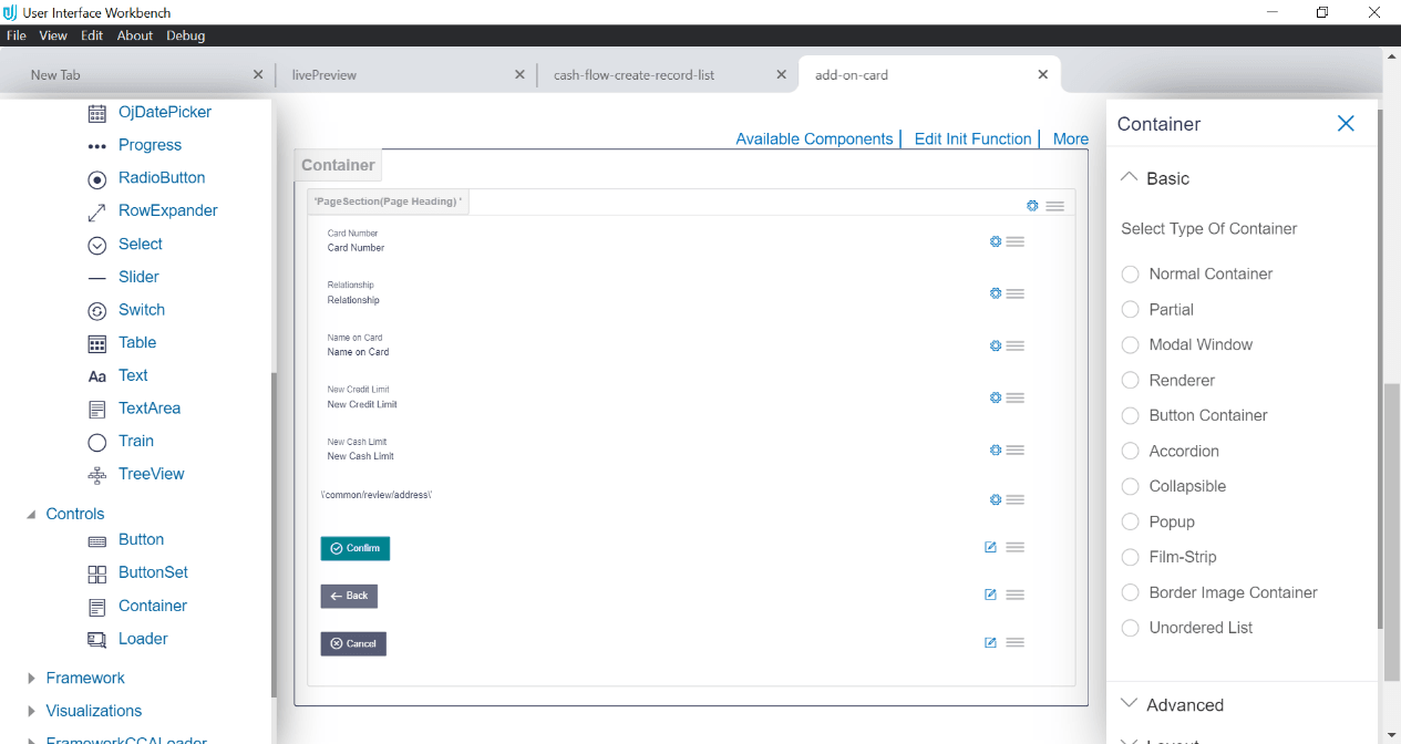
10.38 Select Type of Container
- Normal Container: This is the most basic type of container which
is used to group an element to:
- apply a common style
- repeat a form section on page
- hide and display form section
- apply grid size to a form section
In the below example, normal container option has been selected. Two elements will be added with a gap in between them. User can drop any form element inside it.
In the below image an input box and date picker are added inside a normal container.
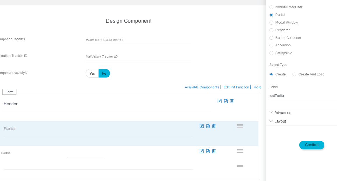
- Partial: Partials are small unit of the page which can be
reused.
Example:
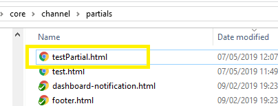
When user chooses a container type as partial and create a component, an extra file will be created in partials folder along with other artefacts (refer creating component) at location. ChannelPath/partials/you_module/label.html.
Generated partials:
To use it, refer component loader or select type ‘create and load’ to use is at same location where container is dropped.
Select Type:
- Create: to create the partial.
- Create and Load: to create and load the partial.
- Modal Window:
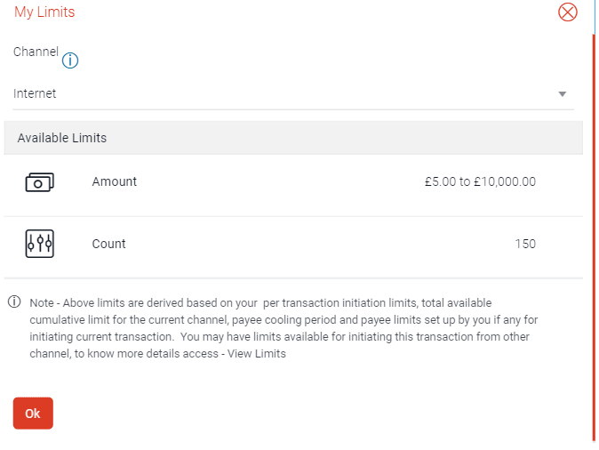
Usage: This container type is used to display the layout in overlay window or dialog box.
Example:
- Renderer
Usage: Renderer are used to design row of Table or ListView.
For reference go to http://jet.us.oracle.com/.
- Container ID: This Id will be mapped to Row Template in case of Table or Renderer Id in case of ListView (refer Table and ListView Section).
- Button Container:
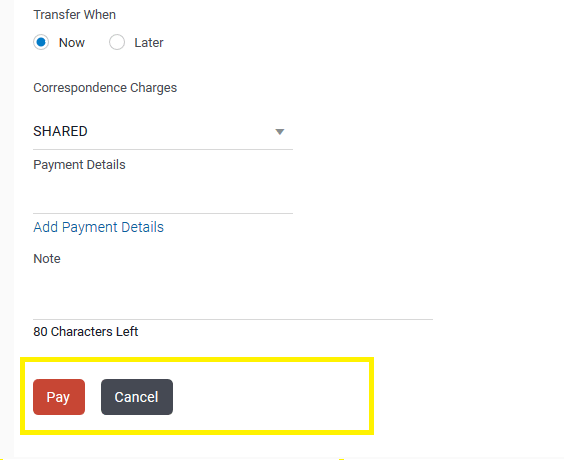
Usage: This container is used to display one or more button as the call to action button. Only buttons can be placed inside this container
Example:
- Accordion:
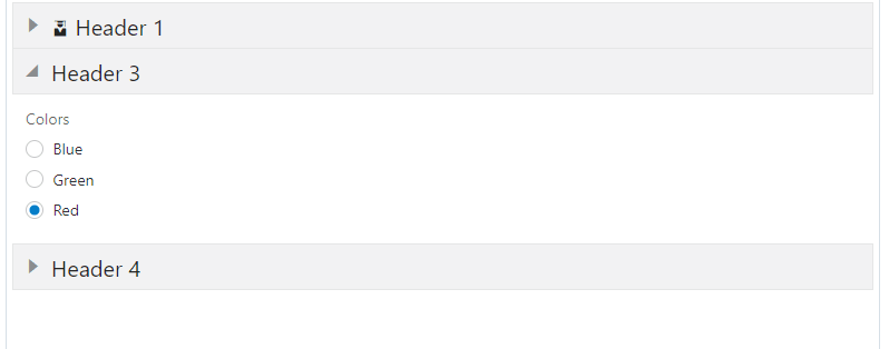
Usage: A vertically stacked element which allows the user to toggle between sections of content is an accordion. Accordion container is used to create a group of collapsible items. A collapsible container is dropped inside it. To know about accordion and its use follow the link:
http://jet.us.oracle.com/jetCookbook.html?component=accordion&demo=basicAccordion.
Example:
- Collapsible:
Usage: Collapsible container can contain any element inside it, which the user uses to toggle between sections of content. To know more about collapsible visit http://jet.us.oracle.com/jetCookbook.html?component=collapsible&demo=basicCollapsible.
Note:
UX Extensibility Toolkit and UI Workbench are used interchangeably.
Parent topic: Available Attributes
