10.25 Pagination
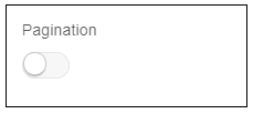
Description: This attribute is used to apply pagination to list/table.
Components to accept the input: Switch
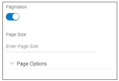
When user enables the switch, it will display an input text and accordion as shown in the image below.
- Page Size: This is used to specify the page size i.e. how many records
should be visible to the user on the first page.
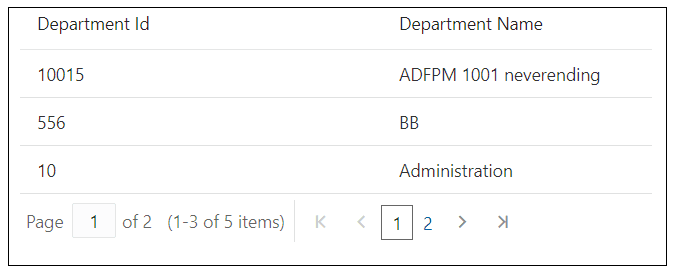
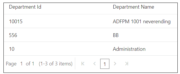
For example, user has given page size as 3, only first three records will be visible to the user as shown in the image below.
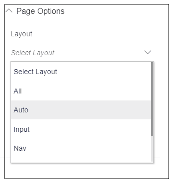
- Page Options: When user expands this accordion, it shows multiple page
options as shown in the image below.
- Layout: This option is used to specify how the paging navigation
controls should be displayed. It has following six options:
- All: Display all controls
- Auto: The Paging Control decides which controls to
display.
- Input: Display the page input control
- Navigation: Display the navigation arrows
- Pages: Display the page links
- RangeText: Display the page range text control
- All: Display all controls
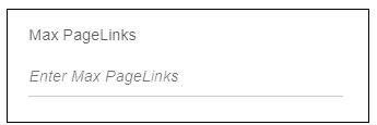
- Maximum PageLinks: This option is used to give the maximum number of
page links to display.
An ellipsis '...' will be displayed for pages, which exceed the maximum number as shown in the image below. maxPageLinks must be greater than 4.
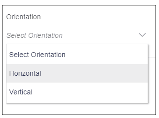
- Orientation: This option is used to give the orientation of the page
links.It has following options:
- Horizontal: This option is used to align the page links
horizontally.
- Vertical: This option is used to align the page links vertically.
- Horizontal: This option is used to align the page links
horizontally.
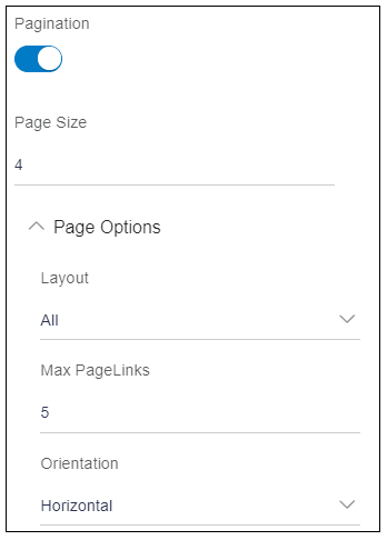
Example: User wants a pagination with following options.
Page size: 4
Layout : ‘All’
Max Page Links: “5”
Orientation: “Horizontal”
Usage: Enter all the options as shown in the image below.
Parent topic: Available Attributes
