10.30 Columns
Description: This attribute is used to add the columns of a table.
Component to accept the input: Accordion, Buttonset and Input text
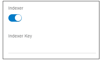
When user enables this switch, it will display an input box as shown in the image below.
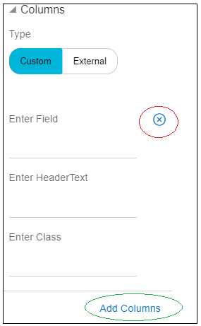
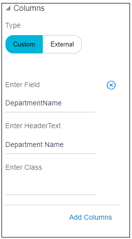
When user expands the “Columns” accordion, it shows a buttonset, with custom and external options as shown in the image below.
- Custom: When user clicks this option, it shows three input text as
shown in the image below.
- Enter Field: This field is used to specify the data field the column refers to i.e. the data of the column.
- Enter HeaderText: This field is used to specify the text to display in the header of the column i.e. name of the column
- Enter Class: This field is used to specify the CSS class to apply to the column cells.
User can add more columns using “Add Columns” link highlighted in green oval in the above image.
User can delete the columns using an icon highlighted in red oval in the above image.
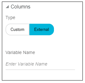
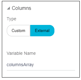
- External: By default, this option will be selected. When user click
this option, it shows an input text as shown in the image below.
- Variable name: This accepts the variable name in which columns information is stored.
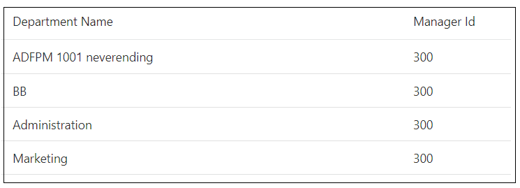
- Custom: User has a table, which display s Department name and
manager ID as shown in the image below.Data source of the table is as following.
var deptArray = [ {DepartmentName: 'ADFPM 1001 neverending',ManagerId: 300}, {DepartmentName: 'BB', ManagerId: 300}, {DepartmentName: 'Administration', ManagerId: 300}, {DepartmentName: 'Marketing', , ManagerId: 300];- For the first column i.e. “Department Name”
- Name of the column is Department Name, headerText is “Department Name”.
- Data of the column is stored in the field DepartmentName (refer the deptArray), field is “DepartmentName”.
- No class is needed.
Usage: Enter all these information as shown in the image below.
- For the second column i.e. “Manager ID”.
- Name of the column is Manager ID, headerText is “Manager ID”.
- Data of the column is stored in the field ManagerId (refer the deptArray), field is “ManagerId”.
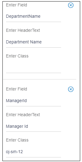
- Class is “oj-sm-12”
Usage: To add this column, click “Add columns”. It will add one more column and add all the details as shown in the image below.
- For the first column i.e. “Department Name”
- External: If user wants to display the same table used in above
example.
User wants to make first column resizable, which can be done by adding resizable: enabled configuration to the column. But in custom type there is no option to add this configuration because it accepts only headerText, field and class.
In such cases, where column has more configuration, use “External” type.
Create one variable “columnsArray”. Add two objects for two columns. In those objects, user can add any configuration needed for the column.
columnsArray = [ {"headerText": "Department Name",
                "field": "DepartmentName",
                "resizable": "enabled"},
                {"headerText": "Manager Id",
                "field": "ManagerId",
                "class": "oj-sm-2"}]
As user can see for the first column, “Department Name”, resizable: enabled configuration is added.
Usage: Enter this variable name in an input box as shown in the image below.
Parent topic: Available Attributes

