3 Web GUI Changes
The PCZ2.3.0 release changes the look, and some of the behavior, of the Web GUI to better align with Oracle's current styles and standards. Although most of the navigation and operations remain the same, some differences occur in the location and design of the controls you use to access and manipulate the objects on the Web GUI. The following information describes the new controls, operations, and behavior of the Web GUI.
Latency Recommendation
Oracle recommends the following guidelines for GUI operation:
- Ensure latency between your laptop browser and the OCECB server does not exceed 10ms for optimum performance of the GUI.
- Clear your browser cache (Ctrl -F5) or press-F5 after load of login page after an upgrade to ensure the system properly applies GUI changes.
Cache Clearance Recommendation
Branding Bar
The branding bar now displays four tabs, instead of five, and the user menu adds the Preferences item. The following screen capture shows the new branding bar, displaying the Home, Configuration, Monitoring, and System tabs.
![]()
- Widgets tab—The former Widgets tab is removed, and its contents now display on the Monitoring tab under Widgets.
- Monitoring
tab—Formerly named Monitor and Trace, the Monitoring tab now
includes the functionality of the former Widgets tab as well as the
pre-existing Monitor and Trace functions. The following screen capture shows
the Monitoring tab with links to Monitor and Trace and Widgets.

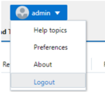
- User Menu—Changes
include the removal of the Screen Help link and the addition of the Preferences
link, which displays a dialog where you can set the view of the navigation
pane.
The following screen capture shows the new User menu.
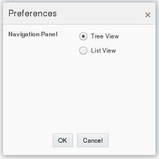
The following screen capture shows the new Preferences dialog, where you can choose either the Tree View (categorical) or the List View (alphabetical) for the objects in the navigation pane.
Home Tab
- General Widget
Controls—The Refresh, Add Widget, and Reset controls now display all together
in the upper right side of the Home page, as shown in the following screen
capture.

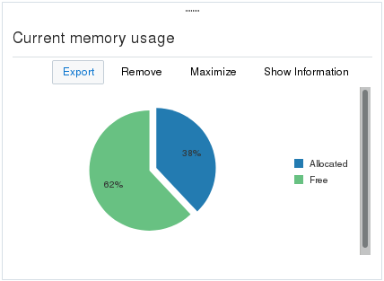
- Specific Widget
Controls—As before, each Widget displays the operational controls related to
its purpose. The controls now display as text, rather than as icons. When you
hover over the text, it becomes a button that you click. For example, in the
following screen capture,
Export is shown as a
button upon hover and the other controls are shown as static text before hover.
Configuration Tab
- Center pane header—Now
displays only the Save, Verify (new), Discard, and Search controls. The Wizards
and Commands controls now display in the navigation pane, rather than in the
page header.

- Verify control—New. Lets you confirm that a configuration is valid before you save the changes. Displays a results report, including error messages and their severity.
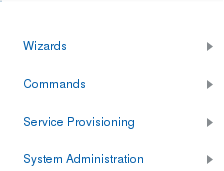
- Navigation pane—Displays
the Wizards and Commands controls, along with the Service Provisioning and
System Administration configuration objects. From Preferences in the User menu,
you can set the display to show the configuration objects in either the tree
view (categorical) or the list view (alphabetical). The following screen
capture shows the tree view.
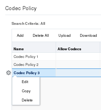
- Edit, Copy, and Delete—The
controls that you use to manage a row in a multi-instance configuration table
are now listed in an context menu that displays when you right-click a row, as
shown in the following screen capture.
- Tool Tips—You no longer
need to hover over the field label to see the Tool Tip. The Tool Tip now
displays as soon as you put the cursor in a field.

Limitations:
- Re-clicking the tab or configuration object that is currently displayed does not refresh the page.
- The Web GUI no longer displays the Discard Configuration confirmation dialog when you change tabs without saving the configuration.
Monitoring Tab
Navigation pane—Displays links to the Monitor and Trace summaries and the Widgets list.

- Monitor and Trace—Click
the arrow to expand the view to display links to the following summaries.
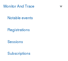
Summary Report—Click the link and the system displays the report with its corresponding controls displayed in text across the top of the summary. When you hover over the text, it becomes a button that you click. For example, in the following screen capture, Refresh is shown as a button upon hover and the other controls are shown as static text before hover.

- Widgets—Click the arrow to
display links to the categories of widgets.
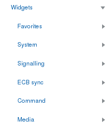
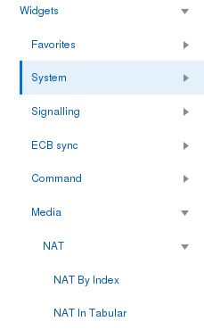
Click a category arrow to display links to the corresponding widgets. The following screen capture shows the Media category expanded to show the NAT object.
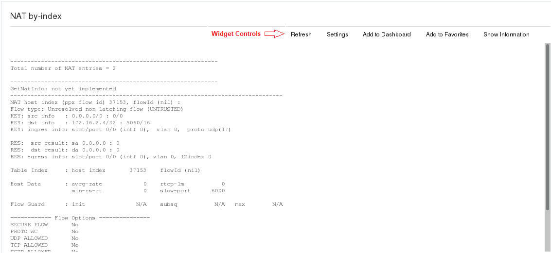
Click a Widget link and the system displays the widget with its corresponding controls displayed in text across the top of the widget. When you hover over the text, it becomes an active button.
System Tab
- Center pane header—The
Force HA Switchover, Reboot, and Support Information links move from the
navigation pane to the center pane header, where they become active buttons
upon hover.

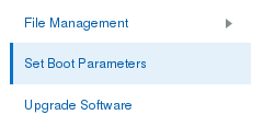
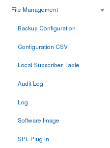
- Navigation pane—The File
Management and Upgrade Software links remain in the navigation pane, which now
includes the Set Boot Parameters link.
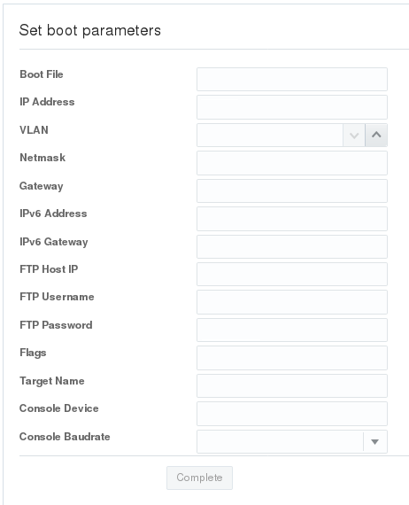
- Set Boot Parameters
displays the following configuration dialog.
- The File Type drop
down list is removed. Use the arrow control by File Management to display the
File Types.
- Set Boot Parameters
displays the following configuration dialog.
- Center pane—When you first
land on the System page, the center pane displays an alphabetical list of links
to the System objects.
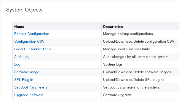
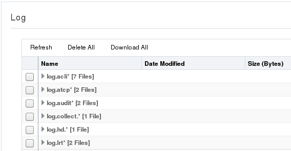
Click a link to display the object. For example, click Log to display the Log table.
