6.3 Example: Creating and Editing a Chart
This section provides an example of creating and editing a chart.
Creating a Chart
The following example shows how to create a chart to understand the cumulative salary earned by each job category.
- Navigate to the Charts page from Database Actions homepage.
- Click Create Chart.
- Enter the details of the chart as follows:
- Name: Total Salary by Job Category
- Description: The cumulative salary earned by each job category.
- Chart Definition:
- SQL
Statement:
SELECT SUM(SALARY), JOB_ID FROM EMPLOYEES GROUP BY JOB_ID - Chart Type: Area Chart
- Orientation: Vertical
- X axis label: Job Category
- Y axis label: Total Salary
- Label:
JOB_ID (VARCHAR2) - Value:
SUM(SALARY) (NUMBER) - Coordinate system: Cartesian
- Sorting: Off
- SQL
Statement:
- Click Preview in the Mapping section
to preview the chart below.
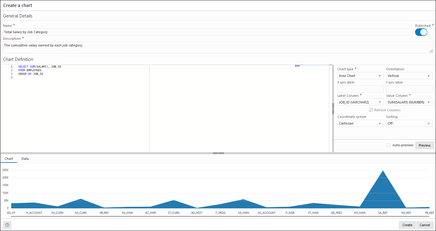
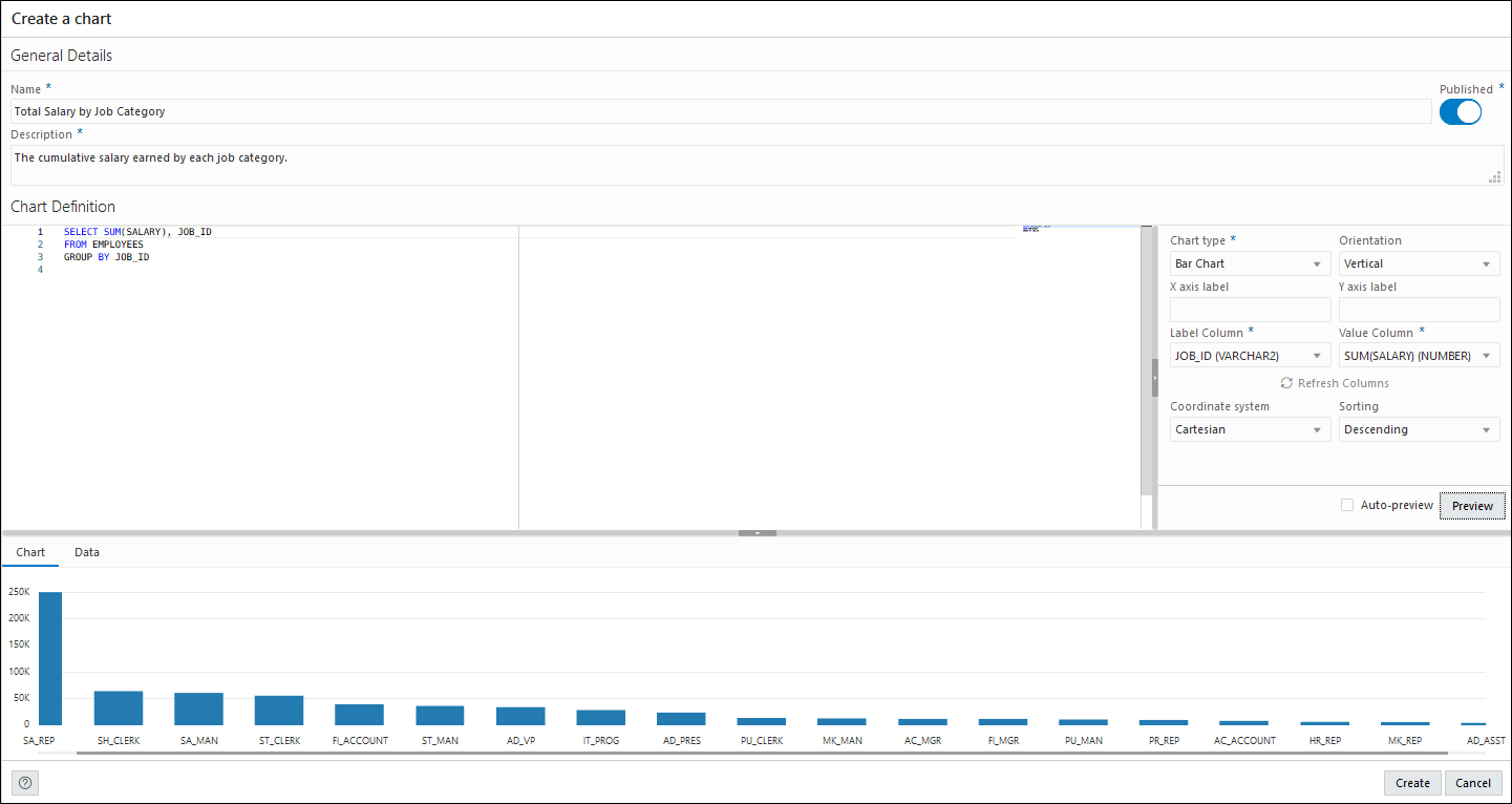
- Change the Chart Type to Bar
Chart, Sorting to Descending and
click Preview to view the updated chart.
- Click Create to create the chart. A confirmation notification is displayed and the chart card is visible in the Charts page.
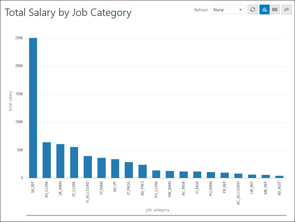
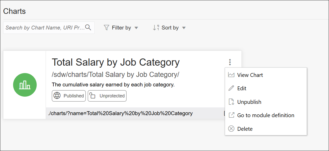
- Click the Selector
 and select View Chart to view the chart in a new tab.
Editing a Chart
The following example edits the chart created in the previous section.
- Click the Selector
 and select Edit to edit the chart.
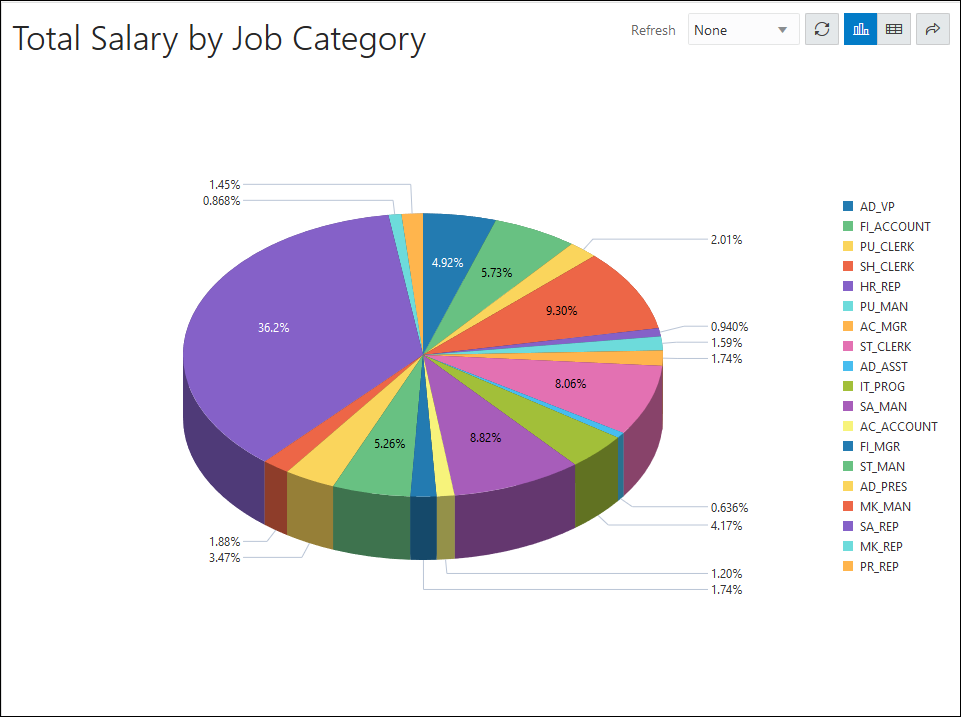
- In the Mapping section, change the Chart Type to Pie Chart and Style to 3D.
- Click Preview to view the updated
chart.
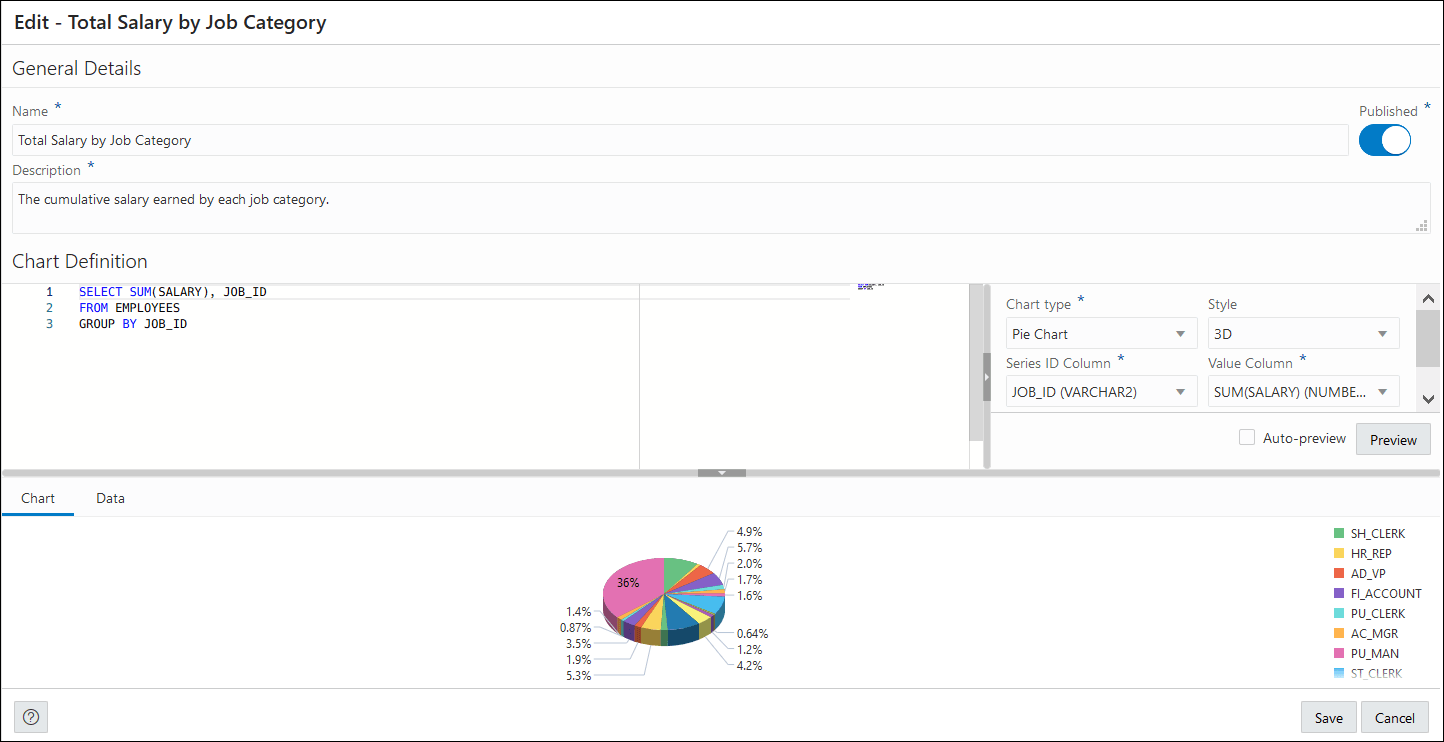
- Click Save.
- Click the Selector
 and select View Chart to view the updated chart in a new tab.
