3.1.4 Evaluate
Before you make predictions using your model on new data, you should first evaluate model accuracy. You can evaluate the model using different methods.
Show Model Accuracy
To check the accuracy of our model, we use a confusion matrix. The confusion matrix is a table that shows the correct model predictions and incorrect predictions for each class. After creating the confusion matrix, the code calculates the accuracy of the model by dividing the number of correct predictions by the total number of predictions.
CMATRIX <- with(RES, table(AFFINITY_CARD, PREDICTION))

CMATRIX

              PREDICTION
AFFINITY_CARD    0    1
            0 1206  145
            1  180  269
To show the model accuracy, run the following statements:
ACCURACY <- CMATRIX / sum(CMATRIX)
round(sum(diag(ACCURACY)),3)*100

83.6
The result of the confusion matrix shows that the accuracy on the test set is 83.6%
Show Prediction Results
Here you will display the prediction results.
- To display the prediction results, run the following code:
z.show(ore.sort(RES[(RES$"'1'" > 0.5),], by = c("'1'")))
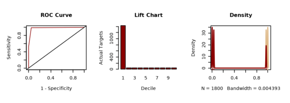
- To display the prediction result using ROC Curve, Lift Chart, and Distribution Chart, run the following code:
# BAR PLOT
res <- ore.pull(RES)
sensitivity <- res[order(res$"'1'",decreasing = TRUE), ]
sens <- sum(sensitivity$"'0'")/sum(sensitivity$"'0'") - cumsum(sensitivity$"'0'")/sum(sensitivity$"'0'")
spec <- cumsum(sensitivity$"'1'")/sum(sensitivity$"'1'")

# LIFT CHART
decile2 <- quantile(sensitivity$"'1'", probs = seq(.1, .9, by = .1))
df_sens <- as.data.frame(sensitivity$"'1'", col.names = c("sens"))
df_sens$decile = as.numeric(cut(1-cumsum(df_sens$sens), breaks=10))


# DISTRIBUTION CHART
dx <- density(res$"'0'")
dx2 <- density(res$"'1'")

# PLOTS 3x1
par(mfrow=c(3,3))
plot(1 - spec, sens, type = "l", col = "darkred", ylab = "Sensitivity", xlab = "1 - Specificity", main = 'ROC Curve')
abline(c(0,0),c(1,1))
paste("AUC: ", round(sum(spec*diff(c(0, 1 - sens))),3))

barplot(table(df_sens$decile), xlab = 'Decile', ylab = 'Actual Targets', main = 'Lift Chart', col = "darkred")

plot(dx, lwd = 2, col = "burlywood",
     main = "Density")
lines(dx2, lwd = 2, col = "darkred")
# Add the data-poins with noise in the X-axis
rug(jitter(res$"'0'"),col='burlywood')
rug(jitter(res$"'1'"),col='darkred')
Parent topic: Classification Use Case