3.2.4 Evaluate
Before you make predictions using your model on new data, you should first evaluate model accuracy. You can evaluate the model using different methods.
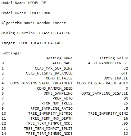
Information about Model settings
Evaluate the model by examining the various statistics generated after building the model. The statistics indicate the model's quality.
- Run the following script for model details available through the
Random Forest model object, like the model settings, coefficients, fit details,
etc.
rf_mod
They can also be displayed and viewed individually as shown below.
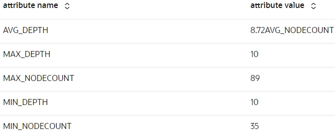
- Run the following script to display the model's global
statistics.
z.show(rf_mod.global_stats)
- Run the following script to display the attribute importance of the
rf_modmodel.z.show(rf_mod.importance)
Score
Here you will make predictions on the test case using the model and then evaluate the model by using methods like Confusion Matrix, Lift Chart, Gains Chart, and ROC curve chart.
- Make predictions on the test data and add the CASE_ID as a
supplemental column so you can uniquely associate scores with the original data.
To do so run the below
script:
# Set the case ID attribute case_id = 'CUST_ID' # Gather the Predictions RES_DF = rf_mod.predict(TEST_X, supplemental_cols = TEST_X) # Additionally collect the PROBABILITY_OF_0 and PROBABILITY_OF_1 RES_PROB = rf_mod.predict_proba(TEST_X, supplemental_cols = TEST_X[case_id]) # Join the entire result into RES_DF RES_DF = RES_DF.merge(RES_PROB, how = "inner", on = case_id, suffixes = ["", ""]) -
To evaluate the model, pass a proxy object
oml.Dataframecontaining predictions and the target columns in a user-defined function named evaluate_model. Evaluate your model using standard metrics. For a classification example, you can evaluate your model using the following:- Confusion Matrix: It displays the number and type of correct and incorrect predictions made with respect to the actual classification in the test data. It is an n-by-n matrix where n is the number of classes.
- Lift Chart: Applies only to binary classification requiring the designation of the positive class. It measures the degree to which the predictions of a classification model are better than randomly generated predictions.
- ROC curve chart: Applies to binary classification and requires the designation of the positive class. These are metrics for comparing predicted and actual target values in a classification model.
Run the below script to generate the metrics and charts:
def evaluate_model(pred_data='', settings_name={''}, name='', target=''):
    """Evaluate the models by passing an proxy oml.Dataframe containing Predictions
    and the target column,
    The Settings name (for the charts),
    The name of the model used (for the charts),
    Supply the target column name for evaluation
    for computing the confusion matrix with the test dataset"""
    import oml
    import numpy as np
    import matplotlib.pyplot as plt
    from sklearn.metrics import auc
    from sklearn.metrics import roc_curve

    conf_matrix = pred_data.crosstab(target,'PREDICTION',pivot=True)

    # Extract Statistics from the Confusion Matrix
    cf_local = conf_matrix.pull()
    TN = int(cf_local[cf_local[target]==0]['count_(0)'])
    FN = int(cf_local[cf_local[target]==0]['count_(1)'])
    TP = int(cf_local[cf_local[target]==1]['count_(1)'])
    FP = int(cf_local[cf_local[target]==1]['count_(0)'])
    TPR = TP/(TP+FN)
    FPR = FP/(FP+TN)
    TNR = TN/(TN+FP)
    FNR = FN/(FN+TP)
    Precision = TP/(TP+FP)
    Accuracy = (TP+TN)/(TP+TN+FP+FN)
    NPV = TN/(FN+TN)
    DetectionRate = TN/(FN+TN)
    BalancedAccuracy = (TPR+TNR)/2

    # Estimated AUC via Triangle (not very precise) could be
    # AUC = (1/2)*FPR*TPR + (1/2)*(1-FPR)*(1-TPR) + (1-FPR)*TPR
    # Compute real AUC using roc_curve by loading the
    # data locally and using the roc_curve() function
    pred_local = pred_data.pull()
    fpr, tpr, _ = roc_curve(pred_local[[target]],pred_local[['PROBABILITY_OF_1']])
    AUC = auc(fpr, tpr)
    opt_index = np.argmax(tpr - fpr)
    FPR_OPT = fpr[opt_index]
    TPR_OPT = tpr[opt_index]
    F1Score = 2*Precision*TPR/(Precision+TPR)
    MathewsCorrCoef = ((TP*TN)-(FP*FN))/((TP+FP)*(TP+FN)*(TN+FP)*(TN+FN))**0.5

    # Store all statistics to export
    statistics = {'Algorithm' : name,
                'Algorithm_setting' : settings_name,
                'TN' : TN,
                'TP' : TP,
                'FP' : FP,
                'FN' : FN,
                'TPR' : TPR,
                'FPR' : FPR,
                'TNR' : TNR,
                'FNR' : FNR,
                'Precision' : Precision,
                'Accuracy' : Accuracy,
                'NPV' : NPV,
                'DetectionRate' : DetectionRate,
                'BalancedAccuracy' : BalancedAccuracy,
                'AUC' : AUC,
                'F1Score' : F1Score,
                'MathewsCorrCoef' : MathewsCorrCoef
                }
    # Nice round stats for printing to screen
    TOTAL = TP+TN+FP+FN
    TN_P = round((TN/TOTAL*100),2)
    FP_P = round((FP/TOTAL*100),2)
    FN_P = round((FN/TOTAL*100),2)
    TP_P = round((TP/TOTAL*100),2)
    # Print the output nicely on Zeppelin native Table
    print("%table CONFUSION MATRIX\tPREDICTED 0\tPREDICTED 1\nACTUAL 0\t"+
        "True Negative: "+str(TN)+" ("+str(TN_P)+"%)\t"+
        "False Positive: "+str(FP)+" ("+str(FP_P)+"%)\nACTUAL 1\t"+
        "False Negative: "+str(FN)+" ("+str(FN_P)+"%)\t"+
        "True Positive: "+str(TP)+" ("+str(TP_P)+"%)\n"+
        "Accuracy: "+str(round(Accuracy*100,4))+"%\t"+
        "AUC: "+str(round(AUC,4))+"\t"+
        "F1Score: "+str(round(F1Score,4))
        )

    # Multiple Charts for Evaluation
    fig, axes = plt.subplots(nrows=1, ncols=4,figsize=[22,5])
    ax1, ax2, ax3, ax4 = axes.flatten()
    fig.suptitle('Evaluation of the '+str(name)+' Model, with settings: '+str(settings_name), size=16)

    # Statistics
    ax1.axis('off')

    # Function to return rounded numbers if the string is float, return
    # integers otherwise and return characters if not a number
    def round_if_float(content):
        try:
            val = float(content)
        except ValueError:
            return(content)
        else:
            if val.is_integer():
                return(int(content))
            else:
                return(round(float(content),4))

    for num, name in enumerate(statistics):
        ax1.text(0.01,
        (-num*0.06+0.94),
        "{0}: {1}".format(name,round_if_float(statistics[name])),
        ha='left',
        va='bottom',
        fontsize=12)

    # Produce Lift Chart
    ax2.set_title('Lift Chart')
    data = pred_local.sort_values(by='PROBABILITY_OF_1', ascending=False)
    data['row_id'] = range(0,0+len(data))
    data['decile'] = ( data['row_id'] / (len(data)/10) ).astype(int)
    lift = data.groupby('decile')[target].agg(['count','sum'])
    lift.columns = ['count', target]
    lift['decile'] = range(1,11)

    data_ideal = pred_local.sort_values(by=target, ascending=False)
    data_ideal['row_id'] = range(0,0+len(data))
    data_ideal['decile'] = ( data_ideal['row_id'] / (len(data_ideal)/10) ).astype(int)
    lift_ideal = data_ideal.groupby('decile')[target].agg(['count','sum'])
    lift_ideal.columns = ['count', 'IDEAL']
    lift['IDEAL']=lift_ideal['IDEAL']

    ax2.bar(lift['decile'],lift['IDEAL']/lift['count'],
    color='darkorange', label='Ideal')
    ax2.bar(lift['decile'],lift[target]/lift['count'],
    color='blue', alpha=0.6, label='Model')
    ax2.axhline((lift[target]/lift['count']).mean(),
    color='grey', linestyle='--', label='Avg TARGET')
    ax2.set_ylim(0,1.15)
    ax2.set_xlabel('Decile', size=13)
    ax2.set_ylabel('Percent of Actual Targets', size=13)
    # Print labels.
    for dec in lift['decile']:
        ax2.text(dec, lift[lift.decile==dec][target]/lift[lift.decile==dec]['count'] + 0.05,
        ("%.0f" % int(round((lift[(lift.decile==dec)][target]/lift[lift.decile==dec]['count'])*100,0)))+"%",
        ha='center', va='bottom')
    ax2.legend(loc="upper right")

    # Produce Gains Chart
    ax3.set_title('Distributions of Predictions')
    pred_local[pred_local[target]==1]['PROBABILITY_OF_1'].rename("Target = 1").plot(kind='density', bw_method=0.1, grid=True, ax=ax3)
    pred_local[pred_local[target]==0]['PROBABILITY_OF_1'].rename("Target = 0").plot(kind='density', bw_method=0.1, grid=True, ax=ax3)
    ax3.axvline(.5, color='grey', linestyle='--', label='Cutoff at 0.5')
    ax3.set_xlim([0,1])
    ax3.set_xlabel('Probability of 1', size=13)
    ax3.set_ylabel('Density', size=13)
    ax3.legend(loc="upper right")

    # ROC curve Chart
    ax4.set_title('ROC Curve')
    ax4.plot(fpr, tpr, color='blue', lw=2, label='ROC curve')
    ax4.plot(FPR_OPT, TPR_OPT,  color='orange', markersize=6)
    ax4.plot([0, 1], [0, 1], lw=2, linestyle='--', color='grey', label='Random guess')
    ax4.annotate('Optimal Cutoff:\nTPR: '+str(round(TPR_OPT,2))+' FPR: '+str(round(FPR_OPT,2)),
                fontsize=11, xy=(FPR_OPT, TPR_OPT), xycoords='data', xytext=(0.98, 0.54),
                textcoords='data',
                arrowprops=dict(facecolor='gray', shrink=0.1, width=2,
                                connectionstyle='arc3, rad=0.3'),
                horizontalalignment='right', verticalalignment='top')
    ax4.annotate('AUC ='+str(round(AUC,4)), xy=(0.5, 0.35),
                xycoords='axes fraction', size=13)
    ax4.annotate('Precision ='+str(round(Precision,4)), xy=(0.45, 0.3),
                xycoords='axes fraction', size=13)
    ax4.annotate('Recall ='+str(round(TPR,4)), xy=(0.4, 0.25),
                xycoords='axes fraction', size=13)
    ax4.annotate('Accuracy ='+str(round(Accuracy,4)), xy=(0.35, 0.2),
                xycoords='axes fraction', size=13)
    ax4.annotate('F1 Score ='+str(round(F1Score,4)), xy=(0.3, 0.15),
                xycoords='axes fraction', size=13)
    ax4.set_xlim([-0.02, 1.02])
    ax4.set_ylim([0.0, 1.02])
    ax4.set_xlabel('False Positive Rate', size=13)
    ax4.set_ylabel('True Positive Rate', size=13)
    ax4.legend(loc="lower right")

    return(statistics, pred_local)

_ = evaluate_model(pred_data=RES_DF, settings_name='Num Trees:25,Sampling Ratio:0.5', name='Random Forest', target='HOME_THEATER_PACKAGE')

- Display the results of customers responding to HOME_THEATER_PACKAGE
with a probability greater than 0.5. Select the columns from the
RES_DFdataset to display. To do so, run the following script:z.show(RES_DF[RES_DF['PROBABILITY_OF_1'] > 0.5])
- Run the following script to get the model accuracy of the
rf_mod. The score function makes prediction on the Test data and the target test data and gives the mean accuracy.print("RF accuracy score = {:.2f}".format(rf_mod.score(TEST_X, TEST_Y)))RF accuracy score = 0.68You obtain an accuracy of 0.68 or approximately 68% of the result are correctly predicted.
To conclude, you have successfully identified customers who are likely to purchase
HOME_THEATER_PACKAGE. This prediction helps to promote and
offer home theater package to the target customers.
Parent topic: Classification Use Case