7.3 Render Graphics
OML4Py provides functions for rendering graphical displays of data.
The oml.boxplot and oml.hist functions compute the statistics necessary to generate box and whisker plots or histograms in-database for scalability and performance.
OML4Py uses the matplotlib library to render the output. You can use methods of matplotlib.pyplot to customize the created images and matplotlib.pyplot.show to show the images. By default, rendered graphics have the same properties as those stored in matplotlib.rcParams.
For the parameters of the oml.boxplot and oml.hist functions, invoke help(oml.boxplot) or help(oml.hist), or see Oracle Machine Learning for Python API Reference.
Generate a Box Plot
Use the oml.boxplot function to generate a box and whisker plot for every column of x or for every column object in x.
Example 7-13 Using the oml.boxplot Function
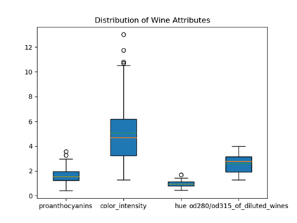
This example first loads the wine data set from sklearn and creates the pandas.DataFrame object wine_data. It then creates a temporary database table, with its corresponding proxy oml.DataFrame object oml_wine, from wine_data. It draws a box and whisker plot on every column with the index ranging from 8 to 12 (not including 12) in oml_wine. The arguments showmeans and meanline are set to True to show the arithmetic means and to render the mean as a line spanning the full width of the box. The argument patch_artist is set to True to have the boxes drawn with Patch artists.
import oml
import pandas as pd
import matplotlib.pyplot as plt
from sklearn import datasets

wine = datasets.load_wine()
wine_data = pd.DataFrame(wine.data, columns = wine.feature_names)
oml_wine = oml.push(wine_data)
oml.graphics.boxplot(oml_wine[:,8:12], showmeans=True,
                     meanline=True, patch_artist=True,
                     labels=oml_wine.columns[8:12])
plt.title('Distribution of Wine Attributes')
plt.show()
The output of the example is the following.

Description of the illustration wine_boxplot.png
The image shows a box and whisker plot for each of the four columns of the wine data set: Proanthocyanins, Color intensity, Hue, and OD280/OD315 of diluted wines. The boxes extend from the lower to upper quartile values of the data, with a solid orange line at the median. The whiskers that extend from the box show the range of the data. The caps are the horizontal lines at the ends of the whiskers. Flier or outlier points are those past the ends of the whiskers. The mean is shown as a green dotted line spanning the width of the each box.
Generate a Histogram
Use the oml.hist function to compute and draw a histogram for every data set column contained in x.
Example 7-14 Using the oml.hist Function
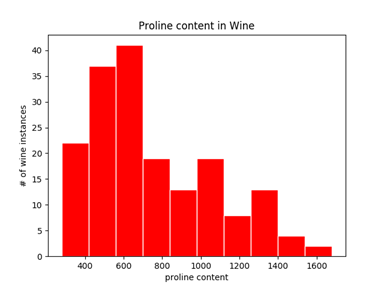
This example first loads the wine data set from sklearn and creates the pandas.DataFrame object wine_data. It then creates a temporary database table, with its corresponding proxy oml.DataFrame object oml_wine, from wine_data. Next it draws a histogram on the proline column of oml_wine. The argument bins specifies generating ten equal-width bins. Argument color specifies filling the bars with the color purple. Arguments linestyle and edgecolor are set to draw the bar edges as solid lines in pink.
import oml
import pandas as pd
import matplotlib.pyplot as plt
from sklearn.datasets import load_wine

wine = load_wine()
wine_data = pd.DataFrame(wine.data, columns = wine.feature_names)
oml_wine = oml.push(wine_data)
oml.graphics.hist(oml_wine['proline'], bins=10, color='red',
                  linestyle='solid', edgecolor='white')
plt.title('Proline content in Wine')
plt.xlabel('proline content')
plt.ylabel('# of wine instances')
plt.show()
The output of the example is the following.

Description of the illustration proline_hist_rw60.png
The image shows a traditional bar-type histogram for the Proline column of the wine data set. The range of proline values is divided into 10 bins of equal size. The height of the rectangular bar for each bin indicates the number of wine instances in each bin. The bars are red with solid white edges.
Parent topic: Prepare and Explore Data