Setting Up Trend Graph Portlets
You can add up to five trend graph portlets to any standard or custom page. Each trend graph portlet includes a Set Up link that you can click to set display options for up to three KPIs.
To set up a trend graph portlet:
-
Click Personalize in the upper right corner of a page or in the Settings portlet.
-
On the Standard Content tab of the Personalize Dashboard palette, click a Trend Graph icon or drag it onto the dashboard. You can see the number of available trend graph portlets by hovering over the icon.
-
Click Set Up in the trend graph portlet's menu.
-
Select standard or custom KPIs from the KPI dropdown list. You can select a maximum of three KPIs.
Important:Custom KPIs are only available in trend graph portlets on pages that include a Key Performance Indicators portlet.
-
You can also edit the following settings:
-
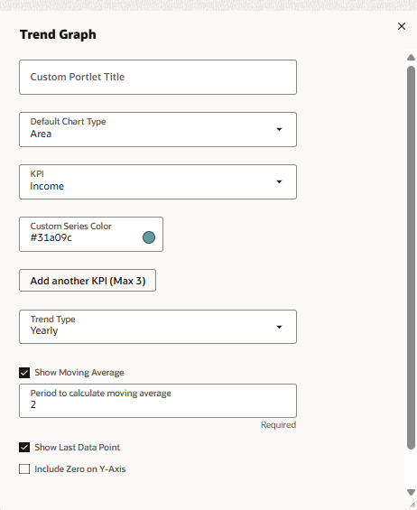
In the Custom Portlet Title field, enter a title for the portlet.
-
Select from the Default Chart Type list to set the default chart type displayed in this portlet.
-
Chart type options are Area, Line, Bar, and Column.
-
You can click thumbnails in the portlet itself to dynamically change its chart type from the default set here.
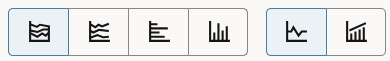
In addition to the set of four chart type thumbnails on the left, each trend graph portlet includes two thumbnails that you can click to choose either a continuous or side-by-side comparison of data in the trend graph.
-
-
If you selected a custom KPI, select a saved search from the Default Trend Type dropdown list. If a saved search isn't available or gives you an error, its setup might not meet the requirements for trend graph display. For information, see Displaying Custom KPI Results in Trend Graphs
-
Select from the Trend Type list to indicate whether the graph's x-axis time scale should be daily, weekly, monthly, quarterly, or yearly. You also can set this option by selecting from a dropdown list in the portlet.
-
Check the Show Moving Average box to display a dotted line in the trend graph, representing the rolling average of KPI data values. This option is enabled by default.
Trend graphs work with simple moving average (SMA). You can find more information about how SMA is calculated in the following link.
-
In the Period to calculate moving average field, enter the number that represents the window of data you want to average based on the date range selected in the Trend Type field. For example, if you select monthly and enter 3 as your window, each data point on your y-axis will represent a 3 month average.
-
Check the Show Last Data Point box to display the most recent KPI data point in the trend graph. Because the last point may not provide complete data, you may want to exclude this point from the graph to avoid a misleading display. This option is enabled by default.
-
Check the Include Zero on Y-Axis box to set the first y-axis value for the trend graph to zero, rather than to the initial KPI data point. This option is disabled by default, to avoid showing misleadingly dramatic increases in initial trend graph data.
-
Select from the Chart Theme dropdown list to set a look and feel for chart data:
-
Global Theme - uses the chart theme set at Home > Set Preferences (the default). See Personal Preferences for Appearance.
-
Basic - provides limited color contrast.
-
Colorful - provides more color contrast.
-
Match Color Theme - Bold - harmonizes with your choices in the Colors section of the Set Preferences page using bolder shades.
-
Match Color Theme - Light - harmonizes with your choices in the Colors section of the Set Preferences page using lighter shades.
-
-
In the Custom Series Color field, enter a hexadecimal value for a custom color you want to use for the chart. (Note that this option is provided for backward compatibility with custom chart colors defined prior to the introduction of chart themes in Version 2012 Release 2.)
-
Select from the Background Type dropdown list to set the display behind chart data:
-
Global Background - uses the background type set at Home > Set Preferences (the default).
-
Lines - provides lines that demarcate different levels along the Y-axis.
-
Bands - provides bands that demarcate different levels along the Y-axis.
-
Grid - provides a grid all throughout the Y-axis.
-
-
-
When you're done, click Save. The portlet will refresh automatically.
Note that each trend graph portlet includes menu options to print the chart, to download it to a PNG, JPG, PDF, or SVG file, and to export its data to a CSV file.
To expand the portlet to full-screen view, click the double arrow icon  .
.