Add Slots to a Fragment
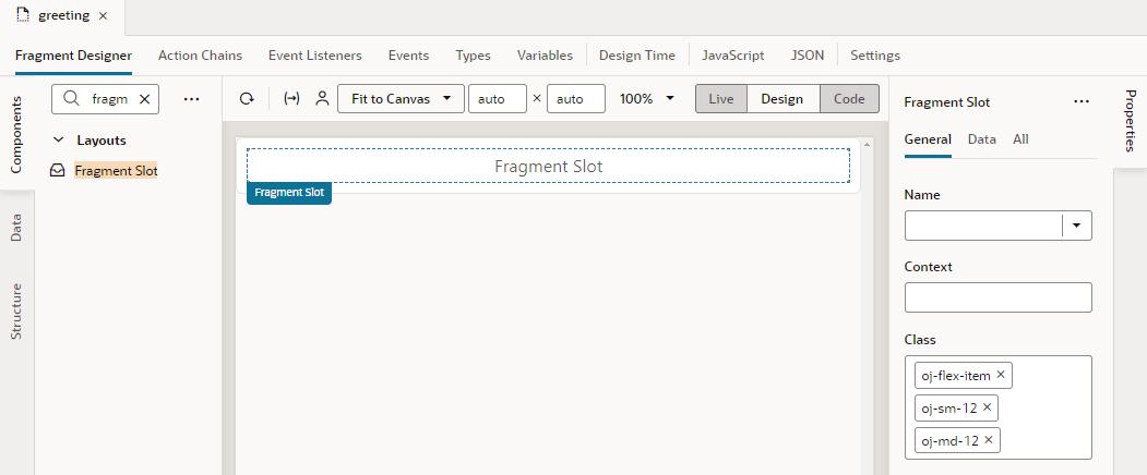
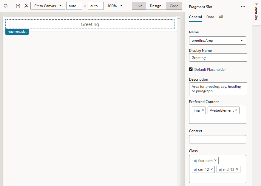
As a fragment author, you can add one or more slots to your fragment as placeholders, so those who consume the fragment can drop in their own components or content. Let's say you want a greeting area for users to add their own content. To do this, you'd define a slot where your fragment's consumers can add whatever they want, be it text or images.
Fragment slots are similar to component slots. They can be used—or left unused—just like component slots. The only difference is that fragment slots cannot have a "default" slot.
To add slots to a fragment:
Note:
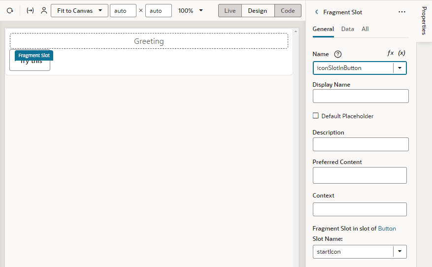
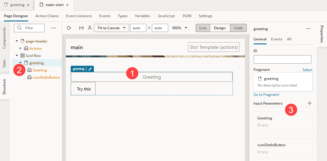
As a best practice, fragment authors should provide default content for any slots they define, just in case the user does not provide their own. See Add Default Content to a Fragment Slot.greeting and iconSlotInButton in our example) on the page canvas (label 1), the page structure (label 2, shown here with Show Slots selected), and the fragment's properties (label 3):- Drag and drop a Heading onto the Fragment Slot (
greeting, for example).Tip:
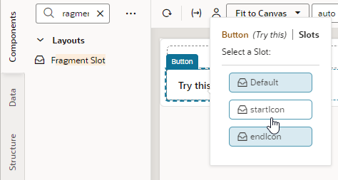
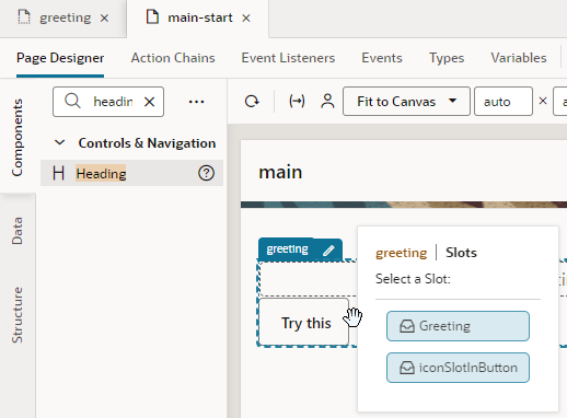
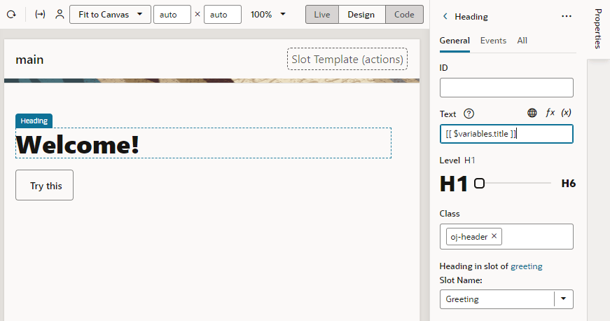
You can add components to a fragment slot on the canvas and in Structure view just as you would component slots. For example, when you drag a Heading component and drop it directly onto the fragment in the canvas, you'll be prompted to select a slot declared in your fragment. This way, you'll be able to drop content into slots that don't include a default placeholder: - Update the slotted component's properties as needed. For example, you might bind the Heading's text to a page-level variable to display your greeting:
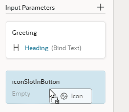
- To customize the fragment slot in the slot inside the button, select the fragment to view the fragment's Properties pane, then simply drag and drop a component of choice onto the fragment slot. For example, drag an Icon from the Components palette onto the iconSlotInButton.
Alternatively, hover over the iconSlotInButton slot in the fragment's Properties pane and click the Insert Component icon (
 ). Components marked as Preferred Components for the slot show in this view. Select a preferred component or any other component of your choice.
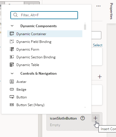
Description of the illustration fragmentslot-propertiespane.png - After you've dropped the icon to the fragment slot, you can select the icon to further customize it:
