Create a New Web Application
You can create multiple web apps within your visual application. Each web app is independent, but they can all use the data sources defined in the visual application.
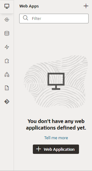
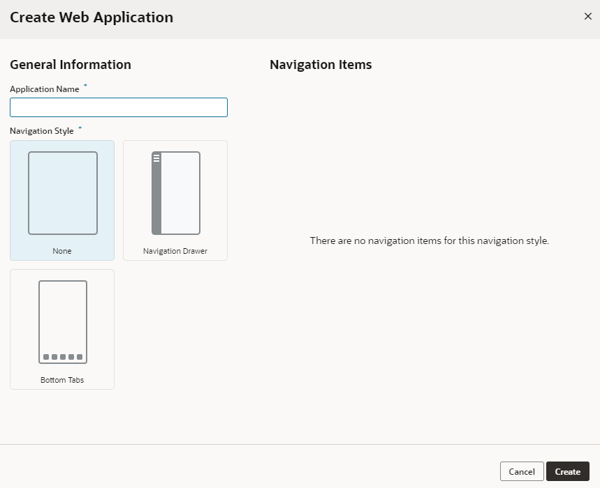
To create a new web application:
Your new web app shows up in the Web Apps pane and opens the flowname-start page, created by default as your application's home page. This page is the default page in the default flow (badged as default next to the page and flow) and is what users will first see when the app is run.
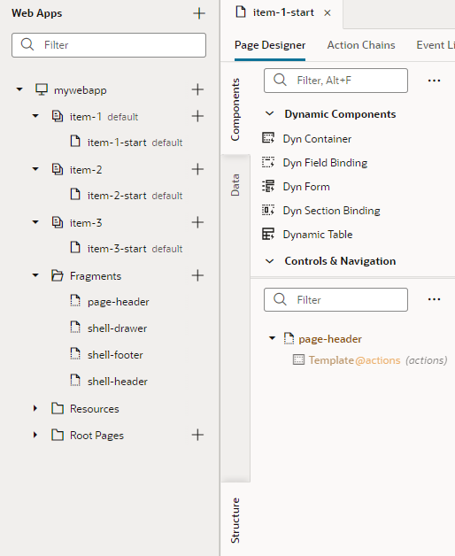
Expand the application node in the Web Apps pane to see the app's structure, with nodes and subnodes representing its artifacts and files. For example, here's a tree view of a web app that uses the Navigation Drawer template (with the default navigation items):
Description of the illustration new-web-app-structure.png
Because a flow is generated for each navigation item, you see multiple flows (item-1, item-2, and so on), each with its own starter page (item-1-start, item-2-start, etc). If you chose None as your template, you would see a single page flow (main).
shell- provide a common set of interactions throughout your application and helps users navigate and interact with your UI:
- The
shell-headerdefines the global header which appears as the topmost element in the browser. It includes your company logo, application name, and user profile, besides other actions and utilities. - The
shell-footerdefines informational components, such as contact details and copyright information, and appears at the bottom of the browser. - The
shell-draweris specific to the Navigation Drawer template and defines the items that form the app's navigation menu in a separate panel.
In addition to shell fragments, a page-header fragment defines page-specific content that appears above a page's main content. You would not work with the page-header fragment directly, but you can customize this fragment on your page to create a custom page-level header.
With your app now created, you are ready to design and develop its pages. You might also want to familiarize yourself with the Designer.
Tip:
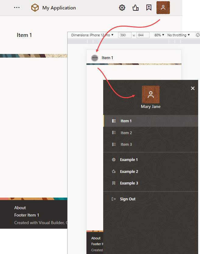
Web app templates lend themselves to responsive layouts and can adjust to the size of the user's screen, ranging from small phones to wide-screen desktops. Here's an example of a web app that uses the Navigation Drawer template:When the form factor is changed to a mobile device, notice how the header items move into the drawer panel when the user clicks ![]() . Additionally, the application title (My Application in the example) is replaced by the page title (Item 1). The global header (which contains the company logo and application title) is displayed only in desktop mode. To customize your app's navigation items as well as elements in the header and footer, see Edit an App's Header, Footer, and Navigation Items.
. Additionally, the application title (My Application in the example) is replaced by the page title (Item 1). The global header (which contains the company logo and application title) is displayed only in desktop mode. To customize your app's navigation items as well as elements in the header and footer, see Edit an App's Header, Footer, and Navigation Items.


