Modify a Table's Default Display
You can modify the default look and feel of tables to provide a more visually appealing display in your application's pages.
Here's how a table mapped to data in a business object (done using the Add Data quick start) displays by default: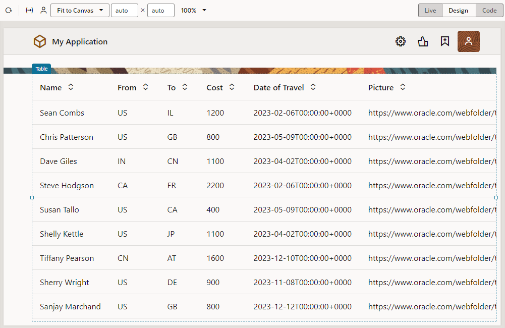
Description of the illustration table-defaultdisplay.png
Display table as a grid
- Select the table on the page to view its properties.
- Select Grid under Display in the Properties pane's General tab.
- If you want to hide the horizontal and vertical gridlines, select Enabled for the Horizontal Grid Visible and Vertical Grid Visible properties.
Here's how the table looks in grid mode (with the horizontal and vertical gridlines still visible):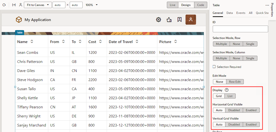
Description of the illustration table-grid.png
Note:
If the table displays as text, it's likely that the page's responsive design is adapting to a smaller canvas. To increase the canvas area, close the Navigator and other tabs in the Page Designer (Components, Data, Structure, and Properties). You can also adjust the viewport resolution in the Page Designer toolbar to resize the canvas, instead of using the default Fit to Canvas option. This approach should make more space for the table to render correctly.Reformat content in table columns
It's possible to reformat the content of your data columns to provide a cleaner and more visual display. For example, you might want to show images or visualize data using gauges.
Display images in a column
- Drag an avatar component from the Components palette and drop it directly onto any row in a particular column on the table (Picture, in our example):
- Update the avatar component's properties as desired, for example, you can change its size and shape as well as give it a background:
- Switch to the Data tab in the Properties pane. Hover over the Src field and click
 to open the Variables picker. Select picture under Current and Row to bind the avatar to the value of that row in the column:
Your data now shows as images:![]()
Description of the illustration table-avatarresults.png
Reformat a date column
- Drag an input date component from the Components palette and drop it directly onto a date-based column (Date of Travel, in our example). The component automatically picks up the existing value.
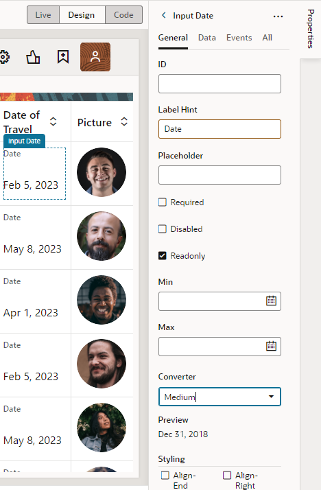
- Update the component's properties, for example, you can use the Converter property to set the format of the date:
You might also want to clear the component's Label Hint field, so Date does not appear in the column.
Visualize data in a column
- Drag a visualization component (for example, the Linear Status Meter under Gauges) and drop it directly onto a particular column in the table (Cost, in our example). The component automatically picks up the existing value.
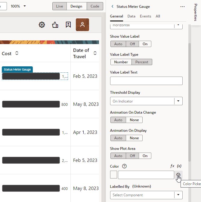
- Update the component's properties as desired, for example, you might change the color of the gauge:
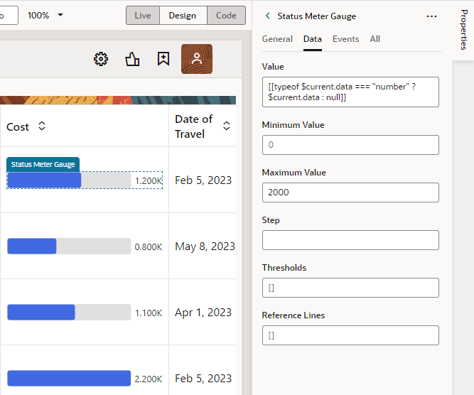
- If your data falls outside the default data range for the gauge component, switch to the Data tab and change the Maximum Value, so your data renders in a more meaningful way:
