Using the Analytics Tabs
The following analytics tabs are displayed on the right side of the Enterprise Process window:
-
Process Analytics: Displays the analytics charts for the enterprise process.
-
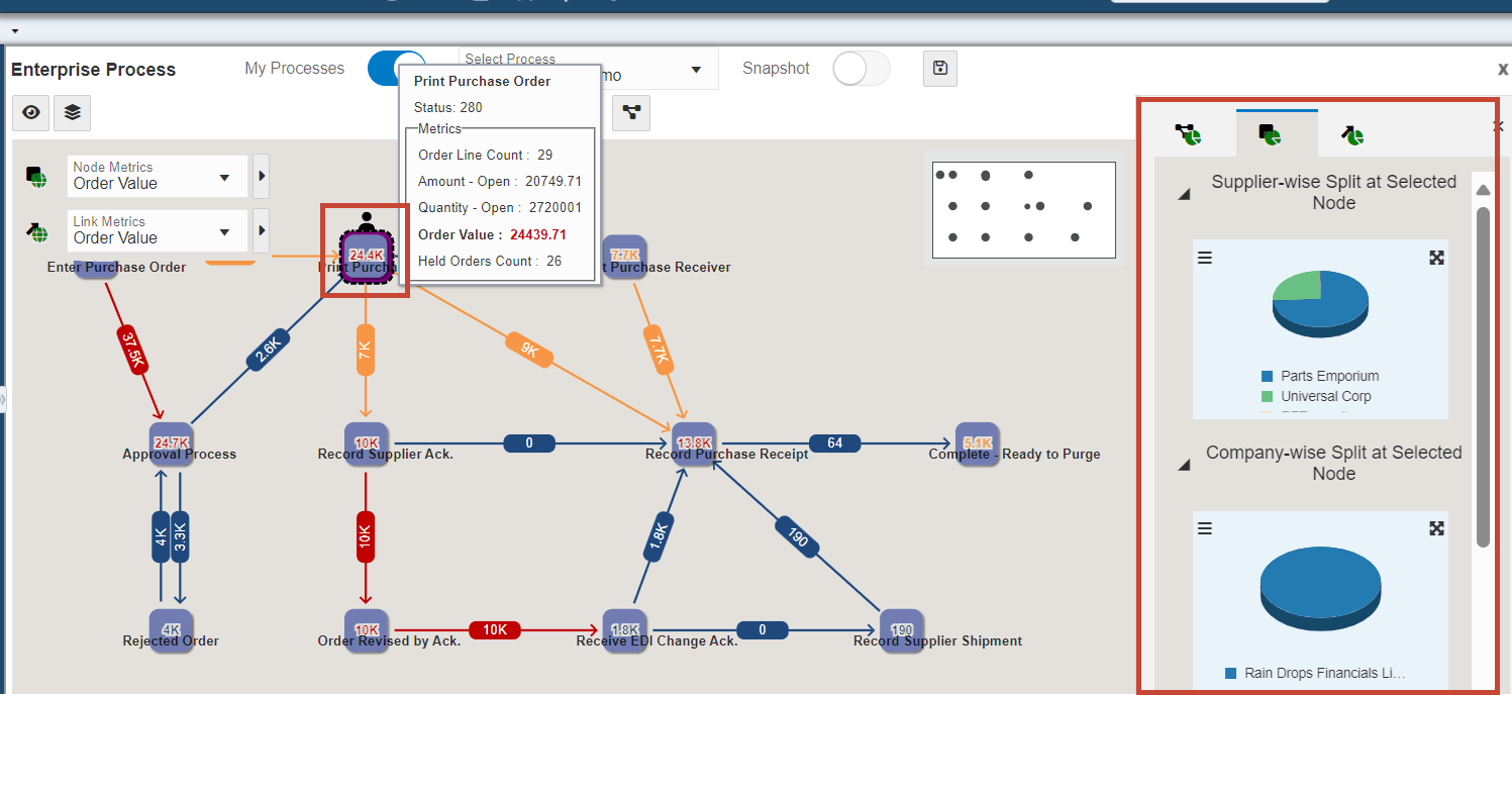
Node Analytics: Displays the analytics charts for the selected node.
-
Link Analytics: Displays the analytics charts for the selected link.
When you click a node, the Node Analytics tab is displayed along with the node-specific
charts, and when you click a link, the Link Analytics tab is displayed along with the
link-specific charts. The system displays the Click to set the context to the process
level icon  when the Node Analytics or Link Analytics tabs are displayed on the right.
Click this icon to view the Process Analytics tab.
when the Node Analytics or Link Analytics tabs are displayed on the right.
Click this icon to view the Process Analytics tab.
The Process Analytics tab displays the charts based on the design of the metrics in the template. The charts displayed in the Node Analytics and Link Analytics tabs are based on the aggregation operator types.
|
Aggregation Operator Type |
Chart Type |
Example |
|---|---|---|
|
counter, sum, and distinct count |
Pie chart |
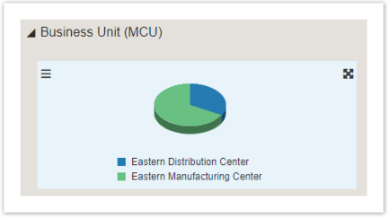 |
|
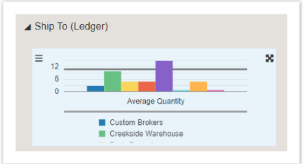
avg, min, max |
Bar chart, with a reference line to present the current context value. |
 |
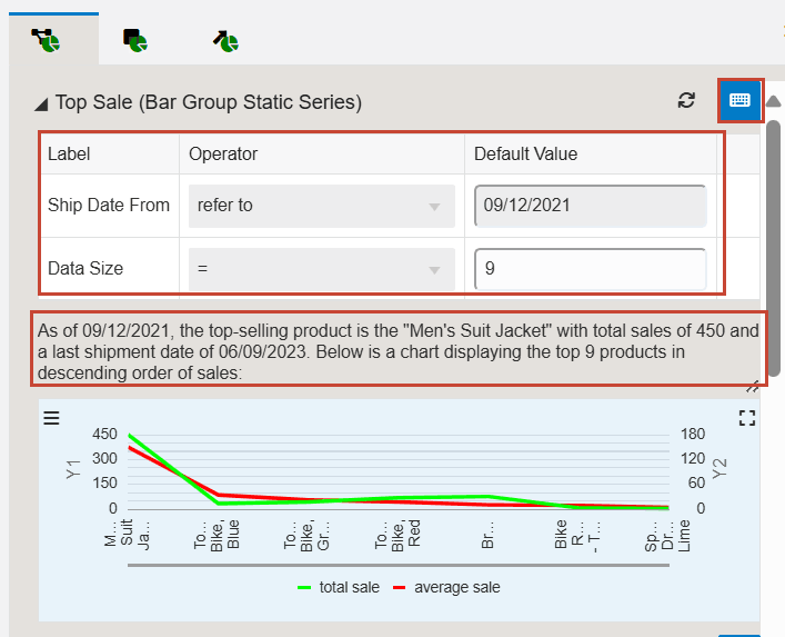
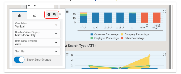
(Release 9.2.26.0) If the analytics charts on the Process Analytics, Node or Link
Analytics tabs, are built using an orchestration or a logic extension, the system
displays the Show Inputs icon  , enabling you to edit the default values. You can edit the values and click
Refresh to view the changes in the description and on the chart.
, enabling you to edit the default values. You can edit the values and click
Refresh to view the changes in the description and on the chart.
You can hide and unhide the analytics tabs by using the Hide Context Analytics 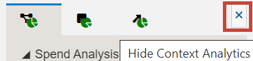 and Show Context Analytics
  icons. You can click the arrow icons to collapse or expand the individual
charts in the analytics tabs. Also, you can click the Maximize
icons. You can click the arrow icons to collapse or expand the individual
charts in the analytics tabs. Also, you can click the Maximize or Minimize
  icons on the charts to view them in maximized or minimized modes.
Maximized Mode of Charts
(Tools Release 9.2.26.0) In the maximized mode of the charts, you can click the Toggle
Table View icon  to view the list of Series, Groups, and Values of the chart in a tabular format.
You can click the Show Query Details
to view the list of Series, Groups, and Values of the chart in a tabular format.
You can click the Show Query Details and Drill into Data
 icons on the rows to view the Query Details and the Data Browser windows.
Additionally, you can right-click the charts to access these windows. To close the table
view, click the Toggle Table view icon.
icons on the rows to view the Query Details and the Data Browser windows.
Additionally, you can right-click the charts to access these windows. To close the table
view, click the Toggle Table view icon.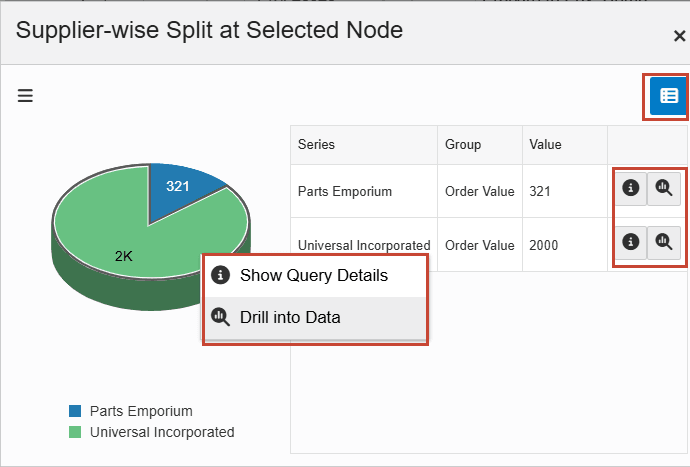
Starting with Tools Release 9.2.26.0, the Configure window displays the Chart Configuration and Series Configuration tabs. The fields displayed on these tabs depend on the chart type (bar or pie chart) and source (aggregation, orchestration, or logic extension) of the analytics charts. The configure window also displays the Show Query Details and Drill into Data icons.
Process Analytics Tab
To make changes and analyze details on the Process Analytics tab:
-
On the chart, click the Configure icon
 and enable the Stack Series option if you want to extend the bar
chart to compare the numeric values between levels of a categorical variable. If
you enable this option for a pie chart, the system displays the data in a bar
chart format.Note:
and enable the Stack Series option if you want to extend the bar
chart to compare the numeric values between levels of a categorical variable. If
you enable this option for a pie chart, the system displays the data in a bar
chart format.Note:Starting with Tools Release 9.2.26.0, the Stack Series option is displayed on the Series Configuration tab (instead of Chart Configuration), and this option is available only for bar, line, area, and combined charts (not the pie charts). You can select the values for the Decimal Places and colors in the Color Theme fields for the Series.
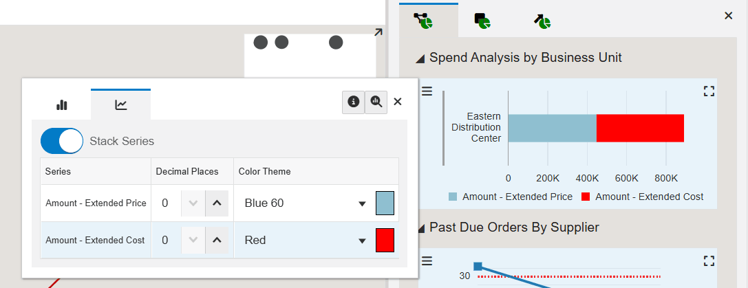
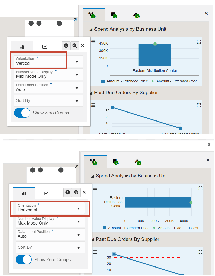
For a bar chart, you can select the values from the Orientation (Vertical or Horizontal) drop-down list. (The pie chart does not have this option.)
-
On the Chart Configuration tab of the Configure window, you can set the values for the Number Value Display, Data Label Position, Sort By, and Show Top fields. You can also enable or disable the Show Zero Groups option.
-
Click Close to close the Configure window.
-
Hover over the colors on the charts to analyze the details.
Node Analytics Tab
To make changes and analyze node-specific analytic details:
- Click a node to view the node-specific analytics on the Node Analytics tab on the
right. Note:
The system displays a People icon and a border to indicate that the node is selected. The system displays a dashed border with a "marching ants" effect around the node when you hover over a selected node.
-
Click the Configure icon
to review the node analytic fields and make the required changes. - Hover over the colors on the charts to analyze the details.
Link Analytics Tab
To make changes and analyze link-specific analytic details:
-
Click a link to view the link-specific analytics on the Link Analytics tab on the right.
Note: The system displays a People icon and a border around the value of the link to indicate that the link is selected. The system displays a dashed border with a "marching ants" effect around the value on the link when you hover over a selected node. -
Click the Configure icon
to review the link analytic fields and make the required changes. - Hover over the colors on the charts to analyze the details.