Style
Use this option to specify the style attributes for a row, column, cell, custom header, or dimension header. Use this option within a row, column, cell override, custom header or header option definition.
Caution:
Use care when applying style attributes to a form. The Style option is a powerful feature and, if used incorrectly, can significantly change the appearance of a form.
Note: When you export to Excel, the style formatting is maintained.
Syntax
Each style property consists of a property name, colon, and value. The value may be one or more words, separated by spaces, for example:
Style:color:red;text-align:rightThe Style option is interpreted by the browser, not by Oracle Hyperion Financial Management, so it is limited only by what the browser supports. The Style option uses the standards supported by the World Wide Web Consortium (W3C).
You can use the Style option keyword one time on a line and add multiple Property:Value pairs. For example:
C3=S#Actual.Y#@CUR(-1),Style:font-color:blue;background-color:red;font-weight:boldThe Style Example table lists some of the properties and potential values that can be used. For a full list, see the Property Index from the W3C.
Table 7-6 Style Examples
| Property | Value |
|---|---|
|
Color (foreground) Background-color |
The color name or the standard hexadecimal RGB notation. For example:
|
|
Font-family |
The font name. For example:
|
|
Font |
The font style. For example:
You can combine up to six font properties in a Style value. For example:
|
|
Font-weight |
The font weight. Values include demi-bold, demi-light, extra-bold, light, extra-light, demi-light. For example:
|
|
Font-size |
The font point size. For example:
|
|
Alignment |
The text alignment. Values include left, right, center, and justify. For example: |
You can combine styles at row and column intersections by including, for a row, a semicolon as the first character in the Style text box or Cust Header Style text box. Note that without the semicolon after the Style keyword, the style defined for the row is used because row values supersede column values when they conflict in the form.
Each cell in the grid displays only its right and bottom borders, so that a single pixel separates adjoining cells. You can use Style to change the color or set the line to dashed for the right or bottom borders. However, if you enable the top or left border, it will be in addition to the bottom border of the above cell and the right border of the cell to the left, respectively. This means you will have two borders. You can avoid double borders by turning off the adjacent border.
You must also set the CustomHeaderStyle of an axis to keep the headers aligned with the grid.
Example
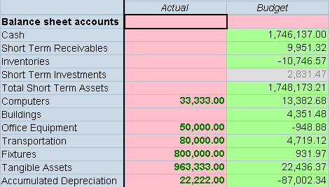
In the following example, the styles from Row 1 (pink background) and Column 1 (pink background and bold, green text) are combined by adding a semicolon after the Style keyword in the row definition. The example for SuppressColHeaderRepeats shows a sample data entry form if this syntax is used.
R1=Blank, CustomheaderStyle: font-weight: bold, CustomHeader: Balance sheet accounts, Style:; Background-color: pinkC1=S#Actual.Y#@CUR, Style: Background-color: pink; color: green;
font-weight: bold