Before You Begin
Purpose
In this tutorial you’ll build a web application that displays information about employees. The focus of this tutorial is on the development of a rich user interface that leverages some of the key concepts of the Oracle Alta UI design system. For more information on Oracle Alta UI – http://bit.ly/oraclealta
To develop the application you’ll be leveraging Oracle JDeveloper and Oracle ADF. Oracle ADF is Oracle’s application development framework for simplifying the development of Java applications, focusing on providing a visual and declarative approach to application development.
As you’ll see during the tutorial the amount of manual code you’ll need to write is minimal. However at any point of time you can click the source tab, and see and modify the actual code of your application.
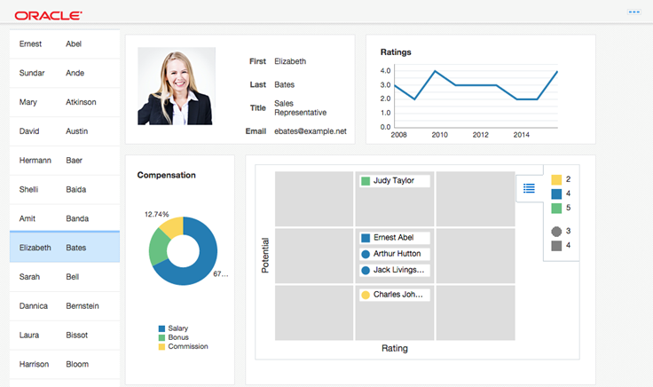
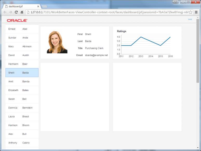
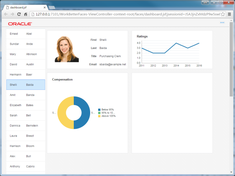
At the end of the tutorial, your application should look like this:
What Do You Need
To complete this tutorial you must:
1: Have access to or have installed Oracle JDeveloper 12.2.1. You can download it from Oracle Technology Network. Install it into a directory of your choice, which, in this tutorial is referred to as JDEVELOPER_HOME.
2: Download the AltaLab.zip and save it to you local drive.
| Required Files | Download Files
|
|---|---|
The application that you create displays information about departments and employees. Click the Download link and save the altalab.zip file to your local hard drive. Then, unzip it and take note of the location. |
Step 1: Open the application and create a page
We are going to skip the part of developing access to our data source for now, and rely on a set of data that is already developed. If you are interested in learning to develop the layer that exposes data we recommend running through this tutorial: Introduction to Oracle ADF Development.
For now we’ll just open an existing project.
-
Start JDeveloper by selecting Start > Programs > JDEVELOPER_HOME > OracleHome > Oracle JDeveloper Studio > Oracle JDeveloper Studio.
If a dialog box opens asking if you would like to import preferences from a previous JDeveloper installation, click No.
-
In the Select Role dialog, select Studio Developer (All Features) and click OK.
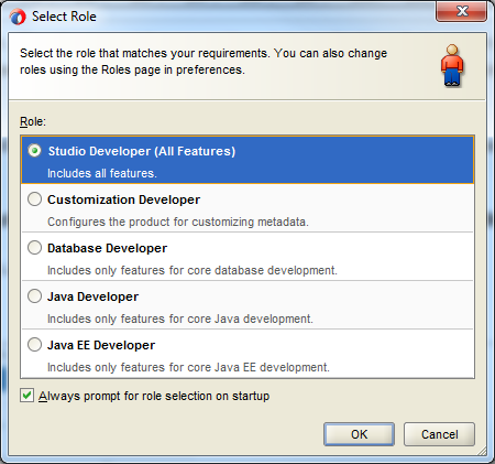
Shaping, which is based on the role of the user, allows the JDeveloper environment to tailor itself. It does this by removing unneeded items from the menus, preferences, new gallery, and even individual fields on dialogs.
Shaping can even control the default values for fields on dialogs within the tool. When you first start JDeveloper, you are prompted to choose a role that describes how you are going to use JDeveloper. If you choose a role of "Java Developer" versus "Database Developer " versus "Customization Developer " you will get a totally different experience!
-
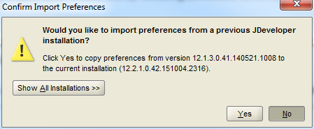
If a dialog box opens asking if you would like to import preferences from a previous JDeveloper installation, click No.
-
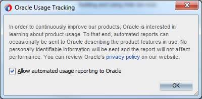
In the Track Usage popup, click OK.
-
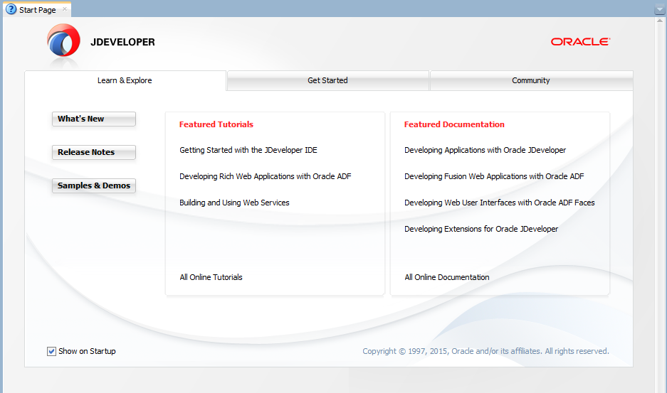
Once loaded, the JDeveloper IDE appears. The very first time you open JDeveloper, the Start Page displays. You can re-invoke the Start Page later by choosing Help > Start Page.
Notice the various options available to help you learn about JDeveloper. After exploring some of these options, close the Start Page by clicking the X on its tab (the X appears when you mouse over the tab).
-
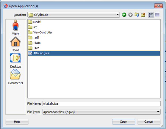
From inside JDeveloper, select Open Application…

-
Navigate to where you unzipped the AltaLab.zip file and select the AltaLab.jws file.
-
The application consists of two projects – the Model project has our data sources. The ViewController project is where we’ll develop our user interface.
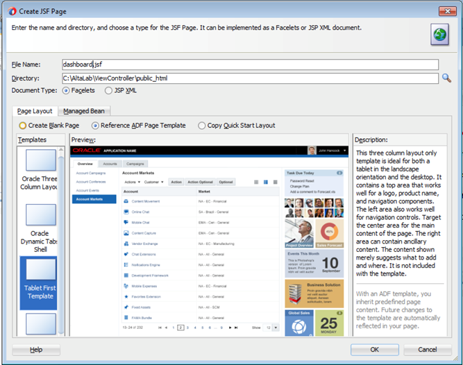
Right click the ViewController project and select New - Page.
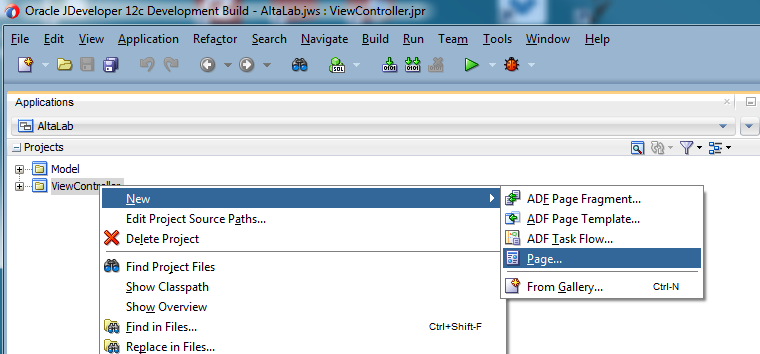
Set the File Name to dashboard.jsf.
Select Reference ADF Page Template and then select the Tablet First Template.
Click OK.
-
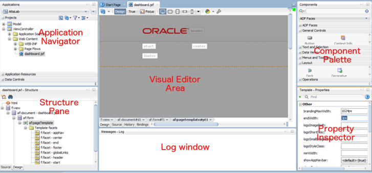
You’ll be taken into the visual page designer in JDeveloper. You see the page template and will be able to design your page dragging and positioning items on the page.
This is a good time to get yourself familiar with the key areas in the JDeveloper IDE.
-
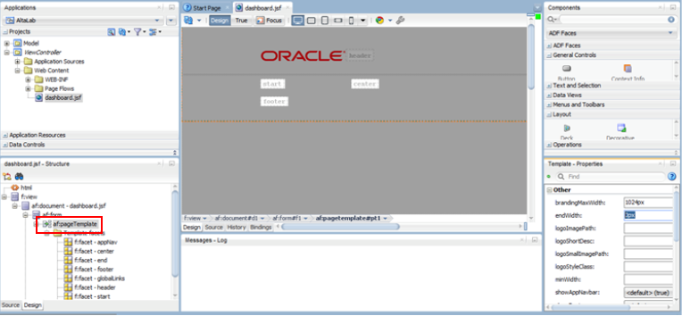
Make sure the af:pageTemplate is selected on the Structure pane on the left and look at the template’s properties.
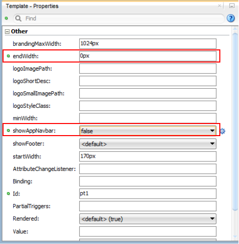
Change the endWidth property to be 0px. Change the value of the showAppNavbar property to false.
Step 2: Add data to the page
In this section, add a list of employees to the page.
-
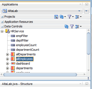
Expand the Data Controls palette accordion in the Application Navigator area, expand the HRService control locate and select the allEmployees data control. This is a collection of the employees working in the company.
-
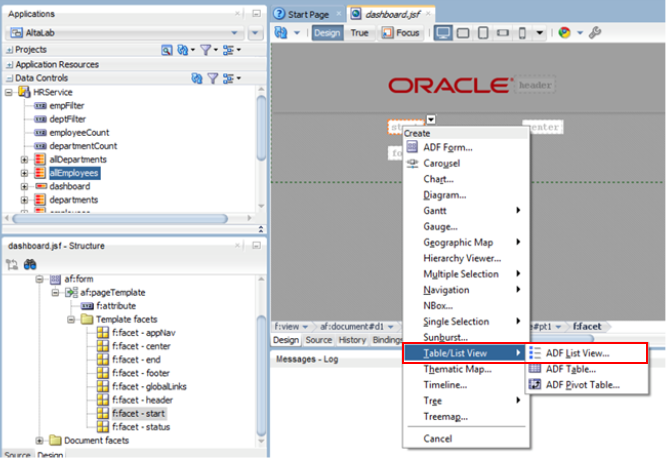
Drag it into the start area on the page in the visual editor area (or the f:facet-start entry in the structure pane)
In the popup menu, select the Table/List View - ADF List View… option.
-
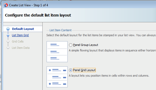
Select the Panel Grid Layout in step 1 of the wizard and click Next.
-
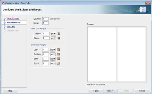
In step 2 change Rows to 1 and click Next.
-
Click Next again in step 3.
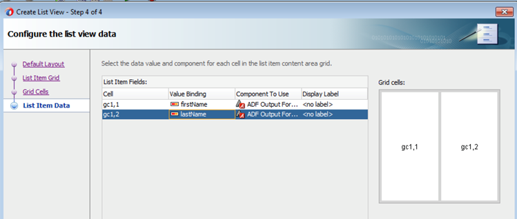
In step 4, in the Value Binding column, select the firstName and lastName for the value binding of the two columns. Then click Finish.
-
This created a list of employees on the page. Let’s enable users to select an employee from the list. To do this, verify that af:listView is selected in the structure pane, and in the property inspector set the Selection property to be single.

-
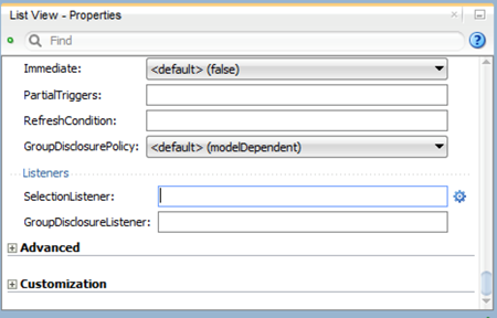
Scroll to the end of the properties and locate the SelectionListener property click the little blue wheel that appears to the right of the value field.
-
From the popup menu, select Method Expression Builder….
Expand the tree to select ADF Bindings - bindings - allEmployees - treeModel - makeCurrent and then click OK.
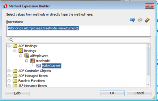
(Alternatively you can just type the value #{bindings.allEmployees.treeModel.makeCurrent} into the value of the selectionListener property.).

-
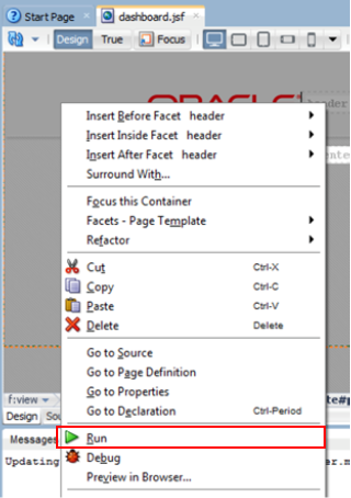
Click the Save All button in the toolbar, and right click inside the page designer to bring up the context menu and select the Run option (green arrow). .
-
This will package your project so far, start WebLogic and deploy your application to it. After a couple of minutes a browser will open showing your page.
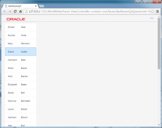
The list of employees will show up and you can select any of them, at the end of the list you’ll also see a “Load More Items” option allowing you to bring the details of more employees into your list. This is ADF optimizing the amount of traffic between the browser and the server.
Step 3: Add responsive layout to the page
Next we are going to create a responsive area on our page that can respond to changes in browser width. This allows us to create a single page that will display in a clear way on tablets in both landscape and portrait mode for example.
Keep the browser open, and switch back into JDeveloper.
We are going to use a Masonry layout component that automates responsive behavior when the browser size is changed.
-
In the structure pane select the f:facet-center area of the template, then from the component palette on the right side expand the “ADF Faces” accordion and click the Masonry Layout component.
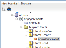
This will add the af:masonryLayout component into the center facet.
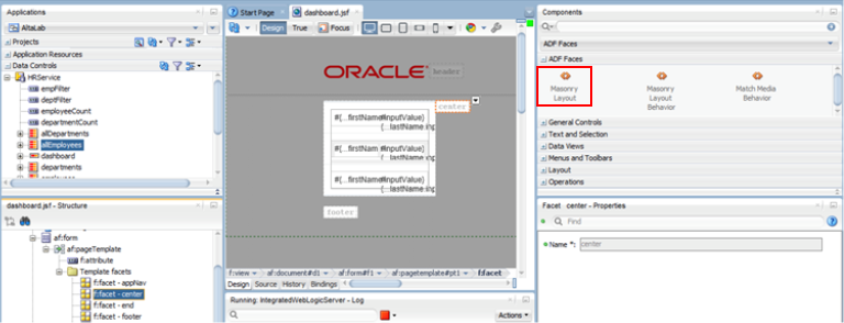
You could also drag and drop it from the component palette to the visual designer or to the structure pane.
-
Next, we are now going to define 4 sections that will populate the masonryLayout..
Expand the Layout section of the components palette and locate the Panel Group Layout component. Then, drag and drop it into the af:masonryLayout in the structure pane.
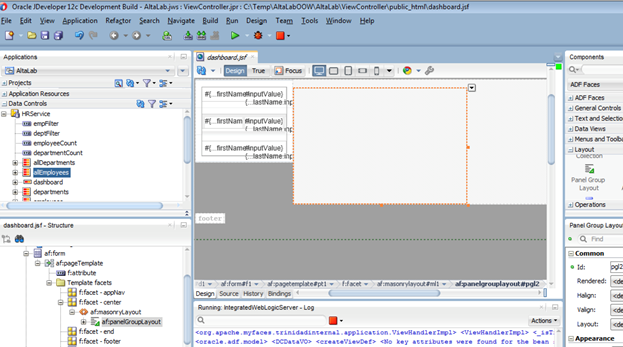
Repeat this three more times, so at the end your af:masonryLayout contains 4 - af:panelGroupLayout components.
-
Use Shift+Select to select all 4 and look at the their properties.
Then, set the Layout property to be vertical

-
Next locate the StyleClass property and set it to AFMasonryTileSize2x1 tileStyle.

-
Click Save All then switch to your web browser and reload the page.
Play with the width of the page to see how the area’s re-arrange when the browser window width is smaller.
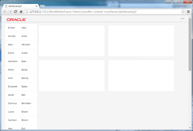
-
Back in JDeveloper, select the two lower af:panelGroupLayout components and change their styleClass from 2x1 to 2x2 – this will make them bigger.

-
Save All and reload the page in the browser to see the change.
If you closed the browser window, scroll up in the log window in JDeveloper to find the URL of the application, you can click on it to open the app in the browser.
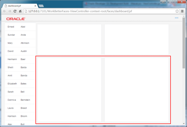
Step 4: Display employee information
In this section, you set data in the first box on our page is going to show the image name and role of the employee we choose from the list. We are going to split the box into two sections using a panelGridLayout.
-
Select the first af:panelGroupLayout in the structure pane (or in the visual editor), then from the component palette - layout select a Panel Grid Layout.
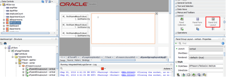
-
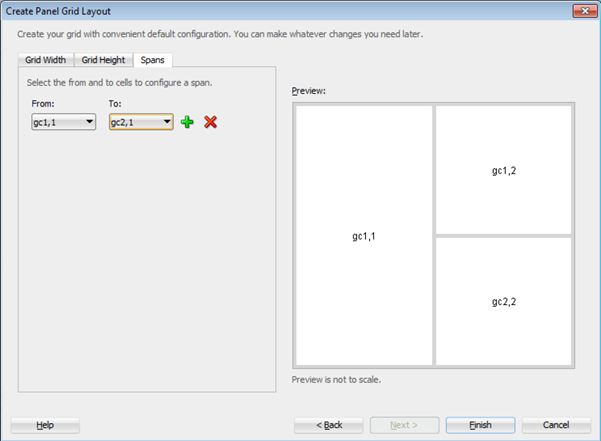
Keep the 2 columns and 2 rows setting and click Next.
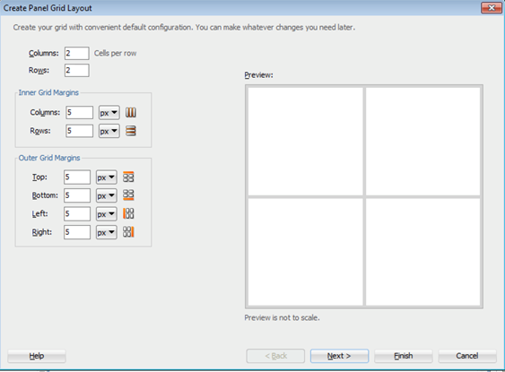
-
In the second step of the wizard switch the Spans tab and define a span from gc1,1 to gc2,1.
Then click Finish.
-
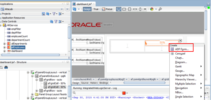
Select the top right gridCell and from the Data Controls palette drag the allEmployees collection into that gridCell and select Create - ADF Form…
-
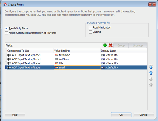
In the Create Form dialog check the Read-Only Form check box and remove all the fields using the red X except for firstName, lastName, title and email. (You can use shift select to select all the fields).
Then click OK.
-
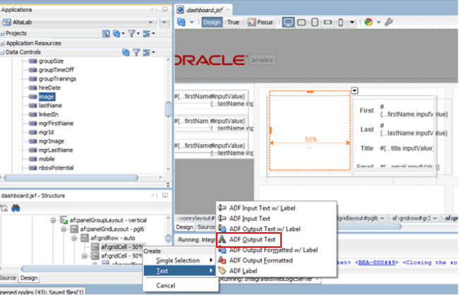
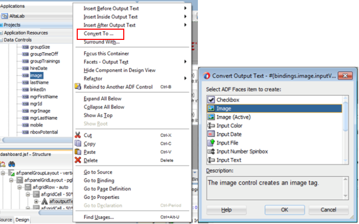
In the data control palette expand the allEmployees node and locate the image attribute. Drag it into the first gridCell and select Text - ADF Output Text.
-
While the new field is selected in the structure pane, copy the value that is inside the Value property of the field. #{bindings.image.inputValue}.

-
Next, we’ll now convert this text field to an image component.
Simply right click the af:outputText and select Convert To… from the popup menu.
Select Image, and then click OK and then click OK to accept the removal of the Value.
-
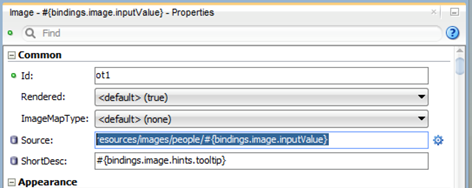
Now we’ll set the source of the image to be the value we copied from the field with the path to our images directory.
Set the Source property of the image component to be resources/images/people/#{bindings.image.inputValue}.
-
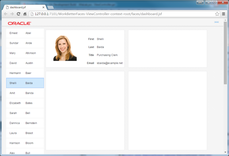
Click the Save All and then click the Rebuild button , then reload the page in your browser.
Select different employees in your list and see the details change in the box.
Step 5: Add a chart to the page
In this section, you add some data visualization to our page. A picture is worth a thousands words – and charts are one of the preferred way of showing data in Oracle Alta UIs.
-
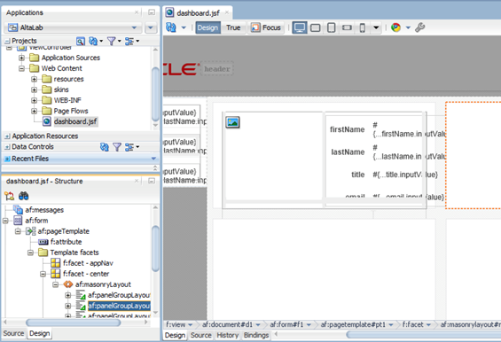
We are going to work with the second af:panelGroupLayout (second box on our page) so select it in the structure pane or the visual page editor.
-
In the data control palette expand the allEmployees data control and scroll down to locate the perfHistory collection – select it and drag it into the second af:panelGroupLayout and select Chart…
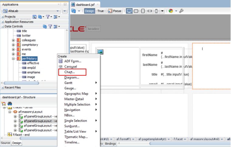
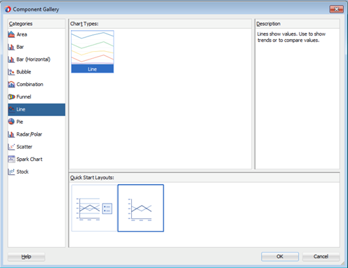
In the popup, select the Line type of chart and the second Quick Start Layout.
Then click OK.
-
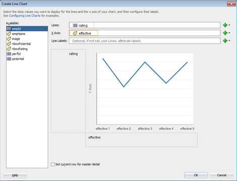
This will take you into the line chart creation dialog, here we are going to define which data is going to be shown in the chart.
For the Lines we wan to use the rating field, and for the X Axis we’ll use the effective field. Drag or select them in the right location.
Then, click OK.
-
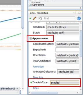
Make sure that the dvt:lineChart is selected in the Structure pane and in the Properties window set the Appearance - TimeAxisType property to enabled.
-
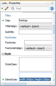
Scroll down to the Title property and set it to Ratings, then locate the InlineStyle field and type width:300px; height:150px; This will size the chart to fit into the box).
-
Save All and Rebuild your project and the reload the browser window.
-
Next we’ll add a chart showing the breakdown of the compensation of an employee.
This will go into the third af:panelGroupLayout on the page.
Locate the pieComp data control and drag it into the third panelGroupLayout drop it as a Chart…
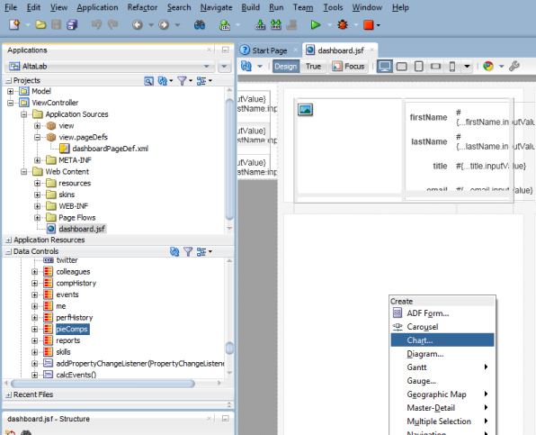
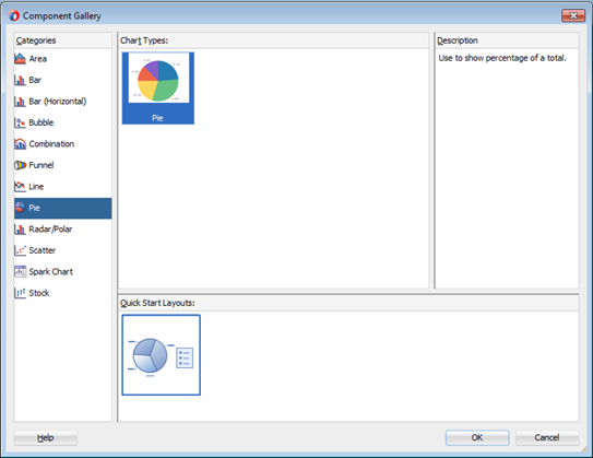
Select the Pie, and click OK.
-
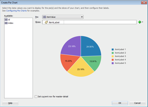
For the pie drop down list select itemValue, drag the itemLevel to the Slices field.
-
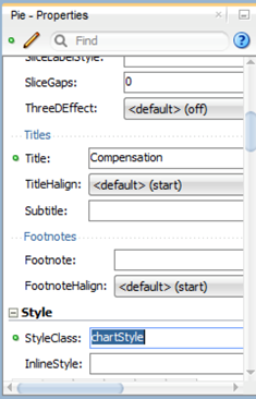
To turn the pie into a doughnut chart, in the properties for the dvt:pieChart set InnerRadius to 0.5, set the styleClass to chartStyle, and the Title to Compensation.
-
Save All and Rebuild your project then reload your browser window.
-
Next we are going to add a special data visualization called NBox – this is a way to represent data points across multiple axis. We are going to see how the peers of the Employee rate in terms of their potential and their ratings. We are going to place this component, so we are going to make the third box smaller and the fourth one bigger.
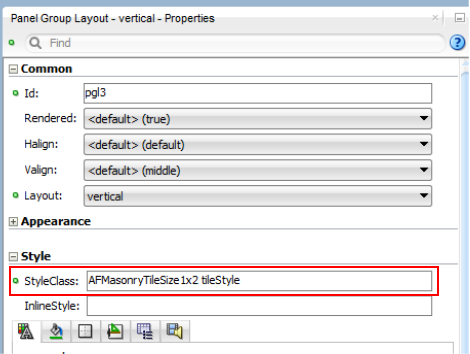
Select the third af:panelGroupLayout and change the style class to AFMasonryTileSize1x2 tileStyle.
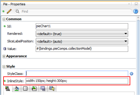
Select the pieChart and in the InlineStyle property change the value to width:150px; height:300px;.
-
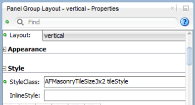
In the fourth af:panelGroupLayout, but we need more space for it, so click the af:panelGroupLayout and update the styleClass to be AFMasonryTileSize3x2 tileStyle.
-
Locate the colleagues collection and drag it into the fourth af:panelGroupLayout choose NBox….
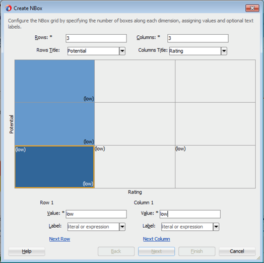
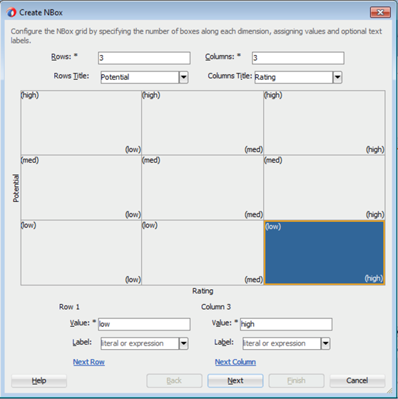
In the first section of defining the NBox we need to define the axis and values of the boxes. Fill out 3 for both Rows and Columns, type Potential and Rating for the rows and columns titles. Then click the lower left corner and in the Row1 and Column1 fields type low.
-
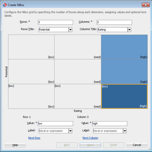
Next click the column to the right and for the empty column value type med.
Then, click on the right most column and type high for the column value.
-
Now let’s fill out the rows. Click the middle row and in the Row value field type med, then click the top row and type high in the row value field.
Your dialog should look like the image below. Then click Next to move the the next step of the wizard.
-
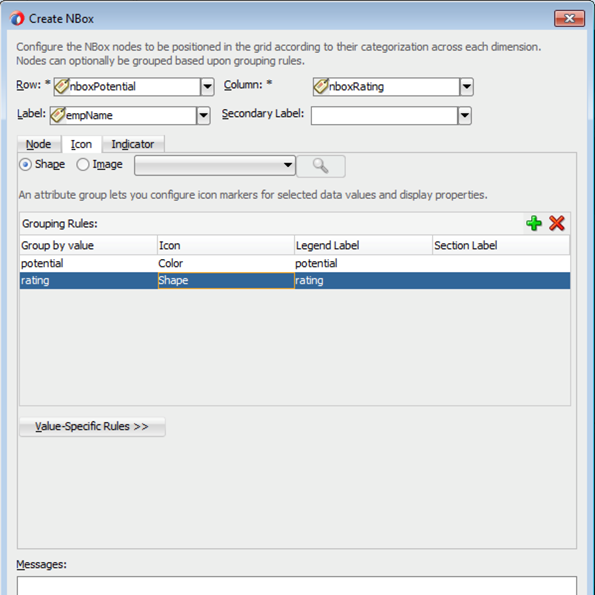
In the next step of the dialog select nboxPotential for Row, and for Column select nboxRating. For Label choose empName.
Click the icon tab, and set the radio button to Shape.
Click the green + sign to add grouping rule:
Select potential for both the Group by Value and Legend columns. The Icon should default to color and that is fine.
Click the green + sign to add another grouping rule:
Select rating for both the Group by Value and Legend columns, and set the Icon to be Shape.
Then click Finish.
-
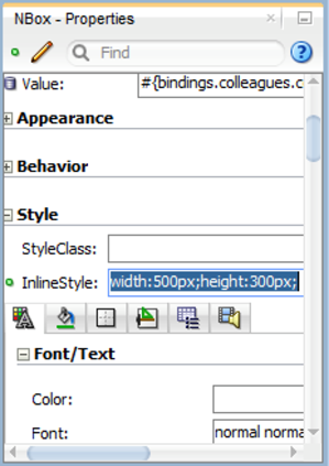
Set the InlineStyle property of the af:nBox to width:500px;height:300px;.
-
Save all and Rebuild your project and reload your page in the browser window.
