4 Skinning
This chapter describes skinning for ADF Mobile browser applications.
This chapter includes the following sections:
4.1 About ADF Mobile Browser Skinning
Skinning enables a page to display consistently on a variety of devices through the automatic delivery of device-dependent style sheets. These style sheets enable optimal display of pages that share the same page definitions on various mobile browsers. Within these style sheets, which enable you to set the look and feel of an application, you not only tailor a component to a specific browser by setting its size, location, and appearance, but you also specify the types of browsers on which components can be displayed or hidden. For more information, see Section 4.2, "Implementing ADF Mobile Browser Skinning." For examples of how to use skinning, see Section 4.3, "Example iPhone Components," which includes an example of an iPhone skin. You can apply a similar style sheet to other mobile browsers, such as BlackBerry, Windows Mobile 6, and Nokia S60. Sample implementations are available from Oracle Technology Network (www.oracle.com/technology).
Note:
Browsers must support the Cascading Style Sheet (CSS) syntax.Features supported on specific browsers require means other than customizing style sheets.
4.2 Implementing ADF Mobile Browser Skinning
To create a skin, refer to Apache Trinidad Skinning in the Development Guidelines for Apache MyFaces Trinidad (http://myfaces.apache.org/trinidad/devguide/skinning.html) which includes descriptions on how to:
-
Create a skin (
trinidad-skins.xml, located in the either the WEB-INF or META-INF directories). -
Create a style sheet.
-
Set the skin family in
trinidad-config.xml(located in the WEB-INF directory).
4.2.1 How to Implement Skinning in an ADF Mobile Browser Application
For ADF Mobile browser, you implement skinning by performing the following tasks:
-
Within the
trinidad-config.xmlcomponent, define the<skin-family>tag with the EL (Expression Language) expression,#{requestContext.agent.skinFamilyType}, that returns the skin family type of the browser. See Section 7.2.1.1, "Determining the Skin Type." -
Specify the renderkit and style sheet in
trinidad-skins.xml -
Include the CSS files within the ADF Mobile browser project
4.2.1.1 How to Define the <skin-family> in trinidad-config.xml
As illustrated in Example 4-1, add the <skin-family> tag within the <trinidad-config> element and specify an EL expression that evaluates to the string that returns the skin family type of the browser.
4.2.1.2 How to Define <skin-family> in trinidad-config.xml to Enable Switching Between Skins
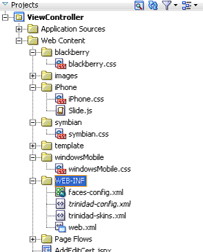
After you create the skin, you can switch between the default skin and another skin, such as an iPhone skin as illustrated in Example 4-2, using the <skin-family> element in Trinidad-config.xml. As shown in Figure 4-1, this component, which is located within WEB-INF enables you to set the default skins for an application. To switch between the default skin and an alternate skin, use Expression Language (EL).
To enable switching between skins:
-
Open the
Trinidad-config.xmlfile. -
Define the EL expression in the
<skin-family>element as illustrated in Example 4-2, which shows switching between the default (minimal) and iPhone skins. -
Save the file. See also Section 7.2.1.1, "Determining the Skin Type."
4.2.2 How to Specify the Renderkit and Style Sheet Name in trinidad-skins.xml
Under <skins>, define the <skin> tags that specifies the render-kit-id and style-sheet-name (org.apache.myfaces.trinidad.desktop and iPhone/iPhone.css, respectively in Example 4-3) for browser types identified in <family>. The value of <family> is the string resulting from the EL expression in the <skin-family> tag in trinidad-config.xml (illustrated in Example 4-1). See also Section 7.2.1.1, "Determining the Skin Type."
Example 4-3 Defining the Skins
<?xml version="1.0" encoding="ISO-8859-1"?>
<skins xmlns="http://myfaces.apache.org/trinidad/skin">
<skin>
    <id>iphone</id>
    <family>iPhonewebkit</family>
    <render-kit-id>org.apache.myfaces.trinidad.desktop</render-kit-id>
     <style-sheet-name> iPhone/iPhone.css </style-sheet-name>
</skin>
<skin>
    <id>symbian</id>
    <family>nokiawebkit</family>
    <render-kit-id>org.apache.myfaces.trinidad.desktop</render-kit-id>
     <style-sheet-name> symbian/symbian.css </style-sheet-name>
</skin>
<skin>
    <id>windowsMobile</id>
    <family>windowsmobile</family>
    <render-kit-id>org.apache.myfaces.trinidad.pda</render-kit-id>
    <style-sheet-name> windowsMobile/windowsMobile.css </style-sheet-name>
 </skin>
<skin>
4.2.3 How to Add the CSS Files to the ADF Mobile Browser Application Project
Include all of the CSS files (such as blackberry.css and iphone.css in Figure 4-1) in the View-Controller project as specified in trinidad-skins.xml.
4.3 Example iPhone Components
CSS 3.0 features enables a Web application to have the same look and feel as a native iPhone application. By creating a new skin in Trinidad for iPhone, you can include iPhone-specific components. Examples of these components include:
-
Header
-
Navigation Panel
-
Field Set
These components illustrate how to apply style classes and how to define style classes using the styleClass attribute.
4.3.1 How to Create Headers in iPhone Applications
The backButton, toolBar, toolBar > h1, and button style classes used with the <tr:panelHeader> and <tr:commandLink> components set the appearance of the Header (Figure 4-2).
Table 4-1 lists the tags used to build headers, the style classes that you define within them, and the layout effects of these classes.
Table 4-1 Header Component Classes
| Tag | Style Class | Layout Effects |
|---|---|---|
|
|
Sets the height, width, border, and background of the header |
|
|
|
Sets the width, height, color, and position of the back button in the header |
|
|
|
Sets the width, height, color, and position of the button in the header |
Example 4-4 illustrates the toolbar style class, which sets the height, width, border, and background for the header.
Example 4-4 The toolbar Style Class
.toolbar {
    box-sizing: border-box !important;
   -webkit-box-sizing: border-box !important;
   -moz-box-sizing: border-box !important;
    border-bottom: 1px solid #2d3642 !important;
    border-top: 1px solid #000000 !important;
    padding: 10px !important;
    height: 45px !important;
    background: url(/images/toolbar.png) #6d84a2 repeat-x !important;
    display: block !important;
}
Example 4-5 illustrates the toolbar > h1 style class, which sets the height, width, font size, and style of the toolbar title.
Example 4-5 The toolbar > h1 Style Class
.toolbar > h1 {
    position: absolute !important;
    overflow: hidden !important;
    left: 50% !important;
    margin: 1px 0 0 -75px !important;
    height: 45px !important;
    font-size: 20px !important;
    width: 150px !important;
    font-weight: bold !important;
    text-shadow: rgba(0, 0, 0, 0.4) 0px -1px 0 !important;
    text-align: center !important;
    text-overflow: ellipsis !important;
    white-space: nowrap !important;
    color: #FFFFFF !important;
    border-bottom: none !important;
}
Example 4-6 illustrates the button style class, which sets the width, height, color, and position of a button in the header.
Example 4-6 The button Style Class
.button {
    position: absolute !important;
    overflow: hidden !important;
    top: 8px !important;
    right: 6px !important;
    margin: 0 !important;
    border-width: 0 5px !important;
    padding: 0 3px !important;
    width: auto !important;
    height: 30px !important;
    line-height: 30px !important;
    font-family: inherit !important;
    font-size: 12px !important;
    font-weight: bold !important;
    color: #FFFFFF !important;
    text-shadow: rgba(0, 0, 0, 0.6) 0px -1px 0 !important;
    text-overflow: ellipsis !important;
    text-decoration: none !important;
    white-space: nowrap !important;
    background: none !important;
   -webkit-border-image: url(/images/toolButton.png) 0 5 0 5 !important;
}
Example 4-7 illustrates the backbutton style class, which sets the width, height, color, and position of the back button in the header.
Example 4-7 The backbutton style class
.backButton {
    position: absolute !important;
    overflow: hidden !important;
    top: 8px !important;
    left: 6px !important;
    margin: 0 !important;
    height: 30px !important;
    max-width: 45px !important;
    line-height: 30px !important;
    font-family: inherit !important;
    font-size: 12px !important;
    font-weight: bold !important;
    color: #FFFFFF !important !important;
    text-shadow: rgba(0, 0, 0, 0.6) 0px -1px 0 !important;
    text-overflow: ellipsis !important;
    text-decoration: none !important;
    white-space: nowrap !important;
    background: none !important;
   -webkit-border-image: url(/images/toolButton.png) 0 5 0 5 !important;
    padding: 0  !important;
    border-width: 0 8px 0 14px !important;
   -webkit-border-image: url(/images/backButton.png) 0 8 0 14 !important;
}
4.3.1.1 Using the styleClass Attribute to Create Header Components
Example 4-8 illustrates how to define the styleClass attribute to create the header components.
4.3.2 How to Create Navigation Panels in iPhone Applications
There are two style classes that define the navigation panel:
-
For static lists, use the
Panel Liststyle class. This style class displays a simple list of navigation items. It sets the width, position, and height of this list. -
For dynamic lists, use the
Table Liststyle class.
4.3.2.1 Using the Panel List Style Class to Create a Static List of Navigation Panels
You define the Panel List style class within a <tr:panelList> component, using <tr:commandLink> tags for each navigation item as illustrated in Example 4-9.
Example 4-9 Defining a Static List of Navigation Items
<tr:panelList styleClass="panelList">
    <tr:commandLink text="commandLink 1"/>
    <tr:commandLink text="commandLink 2"/>
    <tr:commandLink text="commandLink 3"/>
</tr:panelList>
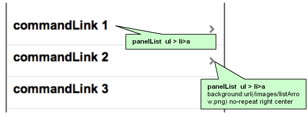
Many CSS features are applied by default on this component when using expressions similar to the ones listed in Table 4-2 on an iPhone skin, as shown in Figure 4-3.
| CSS Expression | Layout Effect |
|---|---|
|
Sets the width, position, and height of the list |
|
|
Sets the position and border at the bottom for each item in the list |
|
|
Sets the margin, font size, height, and background for each navigation item defined within the |
Example 4-10 illustrates the panelList ul style class, which sets the width, position, and height of the list.
Example 4-10 The panelList ul Style Class
.panelList ul {
    position: absolute !important;
    margin: 0  !important;
    padding: 0 !important;
    left: 0 !important;
    top : 45px !important;
    width: 100% !important;
    min-height: 372px !important;
}
Example 4-11 illustrates the panelList ul > li style class, which sets the position and border at the bottom for each item in the list.
Example 4-11 The panelList ul > li Style Class
.panelList ul > li {
    position:relative  !important;
    margin:0  !important;
    border-bottom:1px solid #E0E0E0 !important;
    padding:8px 0 8px 10px  !important;
    list-style:none  !important
}
Example 4-12 illustrates the panelList ul > li > a style class, which sets the margin, font size, height, and background for each navigation item.
Example 4-12 The panelList ul > li > a Style Class
.panelList ul > li > a {
    display:block  !important;
    margin:-8px 0 -8px -10px  !important;
    padding:8px 32px 8px 10px !important;
    text-decoration:none  !important;
    color:inherit  !important;
    background:url(/images/listArrow.png) no-repeat right center  !important;
    min-height:34px !important;
    font-size:20px;
    font-weight:bold;
 }
4.3.2.2 Using the Table List Style Component to Create a Dynamic List of Navigation Items
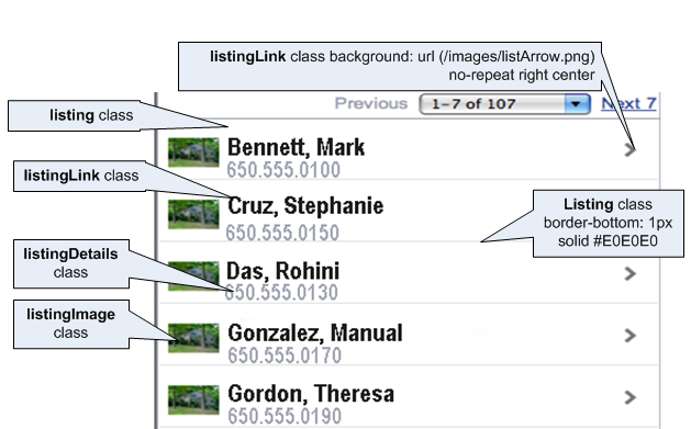
The Table List component enables you to build dynamic tables, such as a table that includes a list of dynamic links as illustrated by Example 4-13. Because the Table List component is a table, it includes built-in navigation. Unlike Panel List, the Table List includes style classes for including images and detailed descriptions below the navigation items, shown in Figure 4-4.
Example 4-13 Building a List of Dynamic Links
<tr:table value="#{bindings.EmployeesView15.collectionModel}"
                            var="row"
                            rows="7"
                            width="100%"
                           styleClass = “iphoneTable”
            emptyText="#{bindings.EmployeesView15.viewable ? 'No rows yet.' :
                     id="mainTable" horizontalGridVisible="false"  >
   <tr:column >
      <tr:panelGroupLayout layout="vertical" styleClass="listing">
         <tr:outputText value="#{row.bindings.PhoneNumber.inputValue}"
                                      styleClass="listingDetails"/>
         <tr:commandLink text="#{row.bindings.LastName.inputValue} ,
                                        #{row.bindings.FirstName.inputValue} “
                                        styleClass="listingLink"
                                        partialSubmit="true"
                                        actionListener = "#{agentUtil.gotoPage2}"
                                        id="myLink1"
                                        disabled="#{!bindings.Execute.enabled}"
                                        onclick='iPhone.slideFragments("page2", "page1")'>
         </tr:commandLink>
         <tr:image styleClass="listingImage"
                                  source="/images/326425649.png"/>
      </tr:panelGroupLayout>
   </tr:column>
</tr:table>
To create a table of dynamic links:
-
Create a Trinidad read-only table using data control.
-
Set the
styleClassattribute for the table asiphoneTable.The expressions listed in Table 4-3 apply the needed iPhone-related CSS properties when you set the
styleClassasiPhoneTable.Expression Layout Effects .iphoneTable .af_table_contentSets the background color for the table content. It overrides the table's default outer-border style to none.
.iphoneTable .af_table_control-bar-topSets the background color for the table controller (pagination)
.iphoneTable .af_column_cell-textSets the background color of the column
-
Set the width of the table to 100.
-
Set the
horizontalGridVisibleattribute to false.Note:
There must be only one column within the<tr:table>tag. Within this column, all tags must be wrapped by a<tr:panelGroupLayout>component with astyleClassset aslisting.
Table 4-4 lists the style classes used within the subelements of the <column> tag.
Table 4-4 Table Listing Style Classes
| Element | Style Class | Layout Effects |
|---|---|---|
|
|
Sets the position and the border for each row |
|
|
|
Sets the width, position, and height of the image |
|
|
|
Sets the position, height, font size, text alignment, background image, and color of the navigation item |
|
|
|
Sets the position, height, font size, text alignment, background image, and color of the navigation description |
Example 4-14 illustrates the listing style class, which sets the position and the border for each row.
Example 4-14 The listing StyleClass
.listing {
    position: relative !important;
    margin: 0 !important;
    border-bottom: 1px solid #E0E0E0 !important;
    padding: 8px 0 8px 10px !important;
    font-size: 20px !important;
    font-weight: bold !important;
    list-style: none !important;
}
Example 4-15 illustrates the listingLink style class, which sets the width, position, and height of the image.
Example 4-15 The listingLink StyleClass
.listingLink  {
    display: block !important;
    margin: -8px 0 -8px -10px !important;
    padding: 8px 32px 8px 10px !important;
    text-decoration: none !important;
    color: inherit !important;
    background: url(/images/listArrow.png) no-repeat right center !important ;
    padding-left: 54px !important;
    padding-right: 40px !important;
    min-height: 34px !important;
    font-size: 20px !important;
    font-weight: bold !important;
}
Example 4-16 illustrates the listingDetails style class, which sets the position, height, font size, text alignment, background image, and color of the navigation item.
Example 4-16 The listingDetails StyleClass
.listingDetails {
    display: block !important;
    position: absolute !important;
    margin: 0 !important;
    left: 54px !important;
    top: 27px !important;
    text-align: left !important;
    font-size: 12px !important;
    font-weight: normal !important;
    color: #666666 !important;
    text-decoration: none !important;
    height: 13px !important;
    padding: 3px 0 0 0 !important;

}
Example 4-17 illustrates the listingImage style class, which sets the position, height, font size, text alignment, background image, and color of the navigation description.
4.3.3 How to Create Detail Items in iPhone Applications
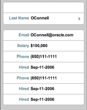
On the destination page, this component displays the detail of an item selected through panel navigation. As illustrated in Figure 4-5, these details include salary, phone numbers, and a hire date for a selected employee.
The Destination Page - Field Set component contains one or more rows where each row contains a label or a message (which can be simple text or another navigation item). As illustrated in Example 4-18, you use the <div> tags to create these rows. The <div> tags are subelements of a <tr:panelCaptionGroup> component.
Example 4-18 Creating a Field Set
<div class="panelBase“>
<tr:panelCaptionGroup>
<div class="row">
<tr:outputText styleClass="labeltext" value="#{agentUtil.name}"
truncateAt="0"/>
<tr:outputText styleClass="messageText"
value="#{sessionScope.FirstName}" />
</div>
<div class="row">
<tr:outputText styleClass="labeltext" value="Last Name"/>
<tr:commandLink text="#{sessionScope.LastName}"
styleClass="messageLink"
partialSubmit="true"
id="myLink2"
actionListener="#{agentUtil.gotoPage3}"
onclick='iPhone.slideFragments("page3", "page2");'
/>
</div>
</tr:panelCaptionGroup>
<tr:panelCaptionGroup>
<div class="row">
<tr:outputText styleClass="labeltext" value="Email"/>
<tr:outputText styleClass="messageText"
value="#{bindings.LastName}@oracle.com"/>
</div>
<div class="row">
<tr:outputText styleClass="labeltext" value="Salary"/>
<tr:outputText styleClass="messageText" }"
value="#{sessionScope.Salary}"/>
</div>
<div class="row">
<tr:outputText styleClass="labeltext" value="Phone"
                    truncateAt="5"/>
<tr:outputText styleClass="messageText"
                  value="#{sessionScope.PhoneId}"/>
</div>
<div class="row">
<tr:outputText styleClass="labeltext" value="Hired"
truncateAt="7"/>
<tr:outputText styleClass="messageText"
value="#{sessionScope.HireDate}"/>
</div>
<div class="row">
<tr:outputText styleClass="labeltext" value="Hired"
truncateAt="7"/>
<tr:outputText styleClass="messageText"
value="#{sessionScope.HireDate}"/>
</div>
</tr:panelCaptionGroup>
</div>
To create field set components:
-
Insert as many
<div>tags as needed within a<tr:panelCaptionGroup>component (illustrated in Example 4-18). -
To create rows, define each
<div>tag with the row class attribute. For example:<div class="row">
The
rowattribute sets the position, height, and border for each row. -
Within each
<div>tag, create a label element as follows:-
Create a
<tr:outputText>tag. -
Set the position, width, font, and color of the label element by defining the
StyleClassas labeltext.
For example:
<tr:outputText styleClass="labeltext" value="Phone" truncateAt="5"/> -
-
Create a message element using either the
<tr:outputText>tag or the<tr:commandLink>component as follows:-
The
<tr:outputText>component withstyleClassset asmessageText. For example:<tr:outputText styleClass="messageText" value="#{sessionScope.PhoneId}"/>The messageText style class sets the position, width, font, and color for the label element.
-
Example 4-19 illustrates the
<tr:commandLink>component withstyleClassset asmessageLink.Example 4-19 Setting the styleClass Attribute as messageLink
<tr:commandLink text="#{sessionScope.LastName}"
   styleClass="messageLink"
   partialSubmit="true"
   id="myLink2"
   actionListener="#{agentUtil.gotoPage3}"
   onclick='iPhone.slideFragments("page3", "page2");'
   />
The messageLink element sets the position, width, font, height, and color for the message element.
-
-
For a panel base background, wrap the
<div>tags with the panelBase class attribute (illustrated in Example 4-18).Note:
The panelBase fieldset sets rounded edges. Thefieldsetelement is added by the renderer for the<tr:panelCaptionGroup>component.
4.3.3.1 Field Set Style Classes
This section lists the style classes for field set components and their layout properties.
Example 4-19 illustrates the labeltext style class, which sets the position, width, font, and color of the label element
Example 4-20 The labeltext Style Class
.labeltext {
    position: absolute !important;
    margin: 0 0 0 14px !important;
    line-height: 42px !important;
    font-weight: bold !important;
    color: #7388a5 !important;
    text-align: right !important;
    width: 90px !important;
    white-space: nowrap !important;
}
Example 4-21 illustrates the messageText style class, which sets the position, width, font, and color for the message element.
Example 4-21 The messageText Style Class
.messageText {
    display: block !important;
    margin: 0 !important;
    border: none !important;
    padding: 12px 10px 0 110px !important;
    text-align: left !important;
    font-weight: bold !important;
    text-decoration: inherit !important;
    height: 42px !important;
    color: inherit !important;
    box-sizing: border-box !important;
   -webkit-box-sizing: border-box !important;
}
.messageLink  {
    display: block !important;
    text-align: left !important;
    text-decoration: none !important;
    color: inherit !important;
    background: url(/images/listArrow.png) no-repeat right center !important ;
    padding-top: 12px !important;
    padding-left: 111px !important;
    padding-right: 40px !important;
    min-height: 34px !important;
    font-size: 16px !important;
    font-weight: bold !important;
}
Example 4-22 illustrates the panelBase style class, which sets the background of the panel base.
Example 4-22 The panelBase Style Class
.panelBase {
    box-sizing: border-box !important;
   -webkit-box-sizing: border-box !important;
    padding: 10px !important;
    background: #c8c8c8 url(/images/pinstripes.png) !important;
}
Example 4-23 illustrates the panelBase fieldset style class, which sets rounded edges. The <fieldSet> element is rendered by the renderer for the <tr:panelCaptionGroup> component.
Example 4-23 The panelBase fieldset Style Class
.panelBase fieldset {
    position: relative;
    margin: 0 0 20px 0;
    padding: 0;
    background: #FFFFFF;
   -webkit-border-radius: 10px;
    border: 1px solid #999999;
    text-align: right;
    font-size: 16px;
}
Example 4-24 illustrates the row style class, which sets the position, height, and border for each row.
Example 4-24 The row Style Class
.row {
    position: relative !important;
    min-height: 42px !important;
    border-top: 1px solid #999999 !important;
   -webkit-border-radius: 0 !important;
    text-align: right !important;
}
Example 4-25 illustrates the row:first-child style class.
4.3.4 What You May Need to Know About CSS Classes in iPhone Applications
Although you manually apply most of the CSS classes to specific components using the styleClass attribute (as in Example 4-8), some CSS features are applied by default when you use the iPhone skin.


